Build an eCommerce website from square one – in fact, there are numerous ways to start but few ways to do it effectively. Learn how to build one today with our guide.
The number of monthly visits to eCommerce websites globally exceeded 21 billion, Statista reports. There is no better time to start your eCommerce business.
In this article, you will learn:
-
- reasons to build an eCommerce website from scratch
- basic and advanced feature-sets for online stores
- top practices and best examples of eCommerce sites
- details on tech-stack for the development process
- cost and timeline required to create an online store
Without further ado, let’s jump right into our journey of making an incredible online store for your business!

Practical Guide to Build an eCommerce Web From Square One
When starting a new business or expanding one, an online presence is a must-have, especially in today’s age, where digitalization is everywhere.
At InApps Technology, we understand your challenges as an owner. That’s why we set out to close the technology gap and make software development easier for you.
Building an eCommerce website from scratch may come as attainable. However, the big question is how to create a successful on-demand delivery service and an online store reaching thousands of daily users.
With your brilliant ideas and our dedicated guideline, we can be the answer you’ve been looking for.
Check Out The Trung Son Pharma Project!
Take a closer look at the Trung Son Pharma project where we leverage our expertise in building eCommerce platforms and complex projects.
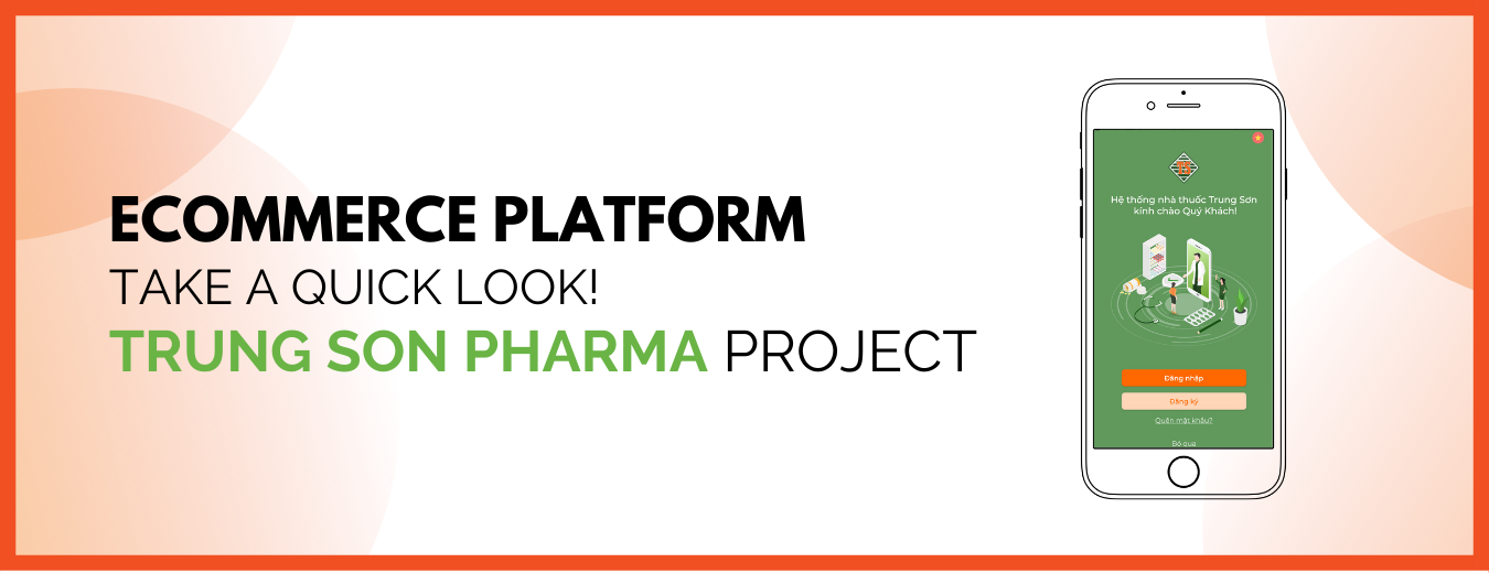
Within a short time span, we developed an integrated eCommerce platform that fits seamlessly with the client’s complex ecosystem. The idea behind Trung Son Pharma is to make shopping stress-free and fast, be it day or night. Users can easily track, place orders, get products delivered right to their doorsteps effortlessly.
Reasons to Build An eCommerce Website From Square One
If you’re thinking about whether building an eCommerce website from scratch is worth your time, let the numbers do the talking!
1. Increase purchases
People prefer to buy online. That’s an undeniable fact. At the end of 2021, the number of digital buyers is expected to reach 2.14 billion worldwide (that’s almost 30% of the world’s population). In 2020 alone, retail eCommerce sales reached 26.7 trillion USD (UNCTAD, 2021).
This trend creates enormous opportunities for growth that business owners need to think hard about how to start making an eCommerce website from square one.
2. Lesser investment
When comparing the cost of building an eCommerce website and opening a brick-and-mortar store, you can see a big difference in budgeting. This is usually the main reason businesses start looking for ways to create their eCommerce site.
3. Convenience
We can’t stress enough the importance of convenience to users. Convenience is why online shopping has become a household name during the last decade. You should keep this one in mind when starting your eCommerce development journey.
4. Reach a wider pool of clients
Reports show that customers generally begin their journey online, meaning they start searching for products information on the internet. If you don’t have an online presence, there is zero to no way for these customers to find your products. By leveraging SEO and digital marketing, building a successful eCommerce web can be more manageable.
5. Use of innovations
Technology progress over time; as an owner, you should be at the forefront when applying new technologies. In other words, technology can help you create a unique selling point and set yourself apart from your competitors.
Our previous post pointed out five technology redefining eCommerce and how you can leverage them to your own advantage.

Build an eCommerce Website: 4 Important Sets of Features
To have a clearer understanding of how to build an eCommerce site effectively, we highly recommend starting with the core functionality.
We will begin by sorting into four groups of features: user-related, product-related, search functionality, and admin panel or content management system (CMS).
The last two groups of features will be in next week’s article. Stay tuned for more!
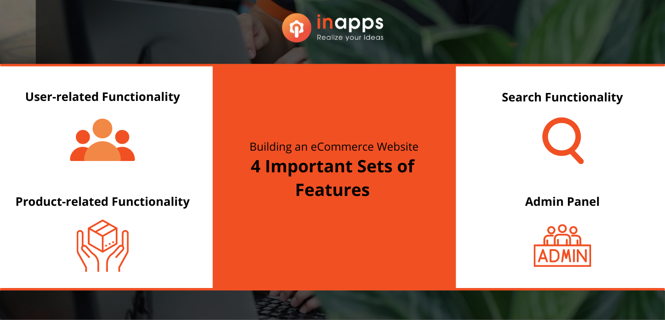
Four Important Sets of Features When Building An eCommerce Website
User-Related Feature Set
Let’s begin with a user-based functionality and its core features.
1.1. Registration
It is recommended to give users multiple options to sign up, for example, emails, phone numbers, or social networks (Facebook, Instagram, Twitter, LinkedIn, etc.).
Also, consider integrating two-factor authentications for enhanced security.
1.2. User profile
In this section, users can provide personal information, create their list of favorite products, add delivery preference, payment methods, view orders and payment history.
Personalization and special offers will definitely bring the customer experience to a whole new level.
With this function, you can achieve three important goals, namely: increase user loyalty, boost customer retention, and last but not least, receive actionable data and analytics on customer behavior – which offline store fails to acquire.
1.3. Shopping history
Shopping history allows customers to have a feeling of control over the data they share. Added to that, customers can better visualize what their purchases are, how much they purchase, etc. Through this, you can offer them an updated or similar version of a specific product and turn their interest to them.
1.4. Coupons & discounts
Coupons, vouchers, or discounts are the most substantial factors affecting customers’ buying decisions, Statista reports.
Consider offering attractive discounts, codes for new users to encourage them to sign up for your site.
In addition, users tend to plan their purchases for upcoming sales. So you can give the option to see the discount schedule, add reminders to their calendar as a special feature to pamper the most loyal customers.
1.5. Wishlist, Favorite list
When figuring out how to build an eCommerce website, a wishlist or favorite list feature may not in your top concern. However, it is essential. A wishlist aims at creating a smoother and more pleasant shopping experience. For this reason, it lets users organized their wished items in a fast and straightforward way.
This feature will help you reduce the drop-off rate. You can take advantage of this data for analytics purposes and even as part of your email marketing campaign. It is a great way to get email addresses from unregistered users.
Pro tip: to make a wishlist more appealing, express your creativity. For example, ModCloth or Shopee notifies their registered users when the items in their lists are on discount. Another one is you can let users share this wishlist with their friends!
1.6. Save for later
When considering how to convert visitors to loyal users, Save for later is a must-have.
However, some online sites use this as an alternative to a wishlist. Save for later lets users set aside certain desired products.
A typical Save for later function doesn’t require user profile registration and allows products to be reflected in the shopping cart. This is a great option to take care of users who opt-in for a guest check-out.
For instance, Nordstorm put a Save for later button on their checkout page. This gives users who already decided to abandon their cart a reason to come back the next day or later on.
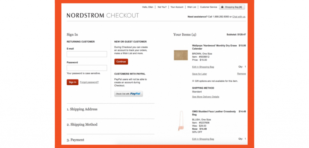
Nordstrom Checkout Example
1.7. Checkout system
You should keep a wide eye on the Checkout system feature. This system includes two major parts – cart and payment options.
Regarding cart, easy checkout is the most popular feature for U.S online shoppers. Even the most simple eCommerce site should not turn a blind eye to this feature.
Next are payment options. These can sometimes get a little bit tricky.
But fear not! You should research the behavior of your targeted consumer. To be more specific, you should understand how they want to pay for their products.
Some segmentation prefers cards like Visa, Mastercard, or more national payments like Napas or NPCI. In contrast, some enjoy the benefit of payments like PayPal, Stripe, etc. In Southeast Asia, users generally opt for mobile money services like GrabPay, ShopeePay, etc. You should also consider COD – Cash on Delivery services.
Stay tuned for the next part. We’ve spent hours researching and had come up with a list of alternative payment methods, so you don’t have to!
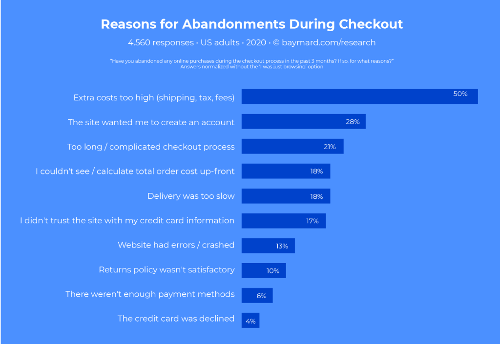
Key Reasons for Cart Abandonments During Checkout (Source: Baymard)
Search Functionality
In eCommerce, speed is everything. It should be your priority to provide users with an easy-to-navigate interface and the fastest way to find their needed product. Statistics show that it only takes 5 seconds for a user to leave your site.
You definitely should keep this in mind when build an eCommerce website by yourself.
2.1. Search & review products
Consider how to arrange the search results. For reference, you may check out different popular eCommerce sites to get inspiration. Remember, you should be in the user’s shoes, not as an owner.
Check out the Lush website; they break down all search results into different categories like articles, products, and ingredients related to a searched term.
Another thing to keep in mind never shows empty results. Whether it is a typo from the user or you simply don’t sell that product, you should always give out related or similar results.
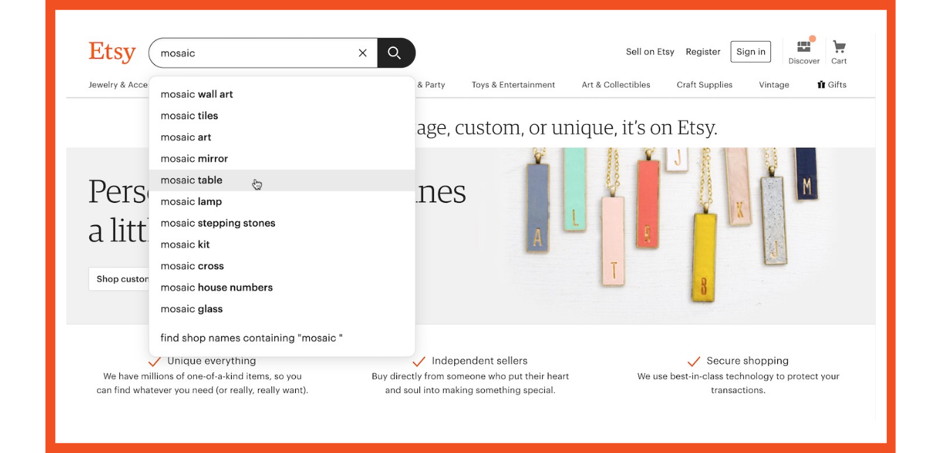
Auto-suggest Function Example
This leads us to the second point – no zero search results.
2.2. No zero search results
If users see empty results, chances are they will quickly bounce off your site. So definitely try to avoid zero-result searches.
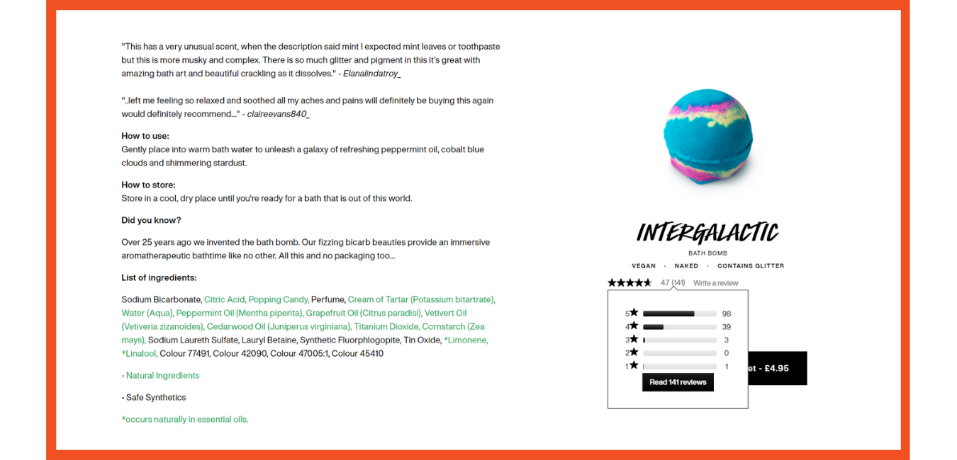
Product Page Example
As we’ve mentioned initially, the customer starts their journey by looking up the product’s information. Therefore, it is essential to keep the product page as detailed as it can get.
You can view many other sites for reference. For the sake of this guide, we will use Lush as a brilliant example. Every Lush product page contains:
-
- a How-to video with each product
- info on the product’s use, benefits
- How-to-use and How-to-store
- a detailed list of ingredients (transparency with your customers can help you go a long way)
- related products or products go well with each other
- product reviews from real customers
2.3. Search by Voice
Thanks to the advancement of technology, we now benefit from many different things, among those are voice assistants.
Widely popular among Millennials and Gen Z, voice search helps their shopping process more pleasant and requires fewer efforts.
Recently, PayPal has updated its iOS app to be compatible with Apple’s Siri. As a result, customers can arrange payments via voice orders.
Nestle and Johnnie Walker are also improving their solutions with speech recognition functionality. Particularly, the whiskey manufacturer has recently partnered with Amazon’s Alexa to enhance their speech ordering.
2.4. Filtering
It is always better to have more filtering options on your website. You can consider filtering by price, size, color, number of sold items, customer reviews, delivery options, payment options, etc.
For reference, a good example is Adidas. Their filtering system lets users display or hide the filtering menu and go through several filtering levels. To make it clearer, you start by filtering sale items, then you enter the category of women’s clothing and end up with many more garment varieties.
Another good example is Mango, as you browse through different categories, you may enter sale items and choose from different colors, ages, sizes, prices range, and even popularity options.
Conclusion
Thank you for reaching the end of this week’s part one on how to build an eCommerce website effectively. In the upcoming week, we will continue with product functionality, admin panel or content management system (CMS); details on tech-stack for the development process; budget and timeline to create an online store.
Driven by integrity, InApps Technology strives to understand client’s needs thoroughly before starting any project. That’s why we keep on sharing these types of informative articles to help you gain more and more insights, and ultimately your firms’ needs and challenges and how to overcome them timely.
Additionally, we’re currently rolling out limited offer in eCommerce development with four pricing plans to fit your business needs. Transparency, No Hidden Cost, Customer Satisfaction are among our goals. Let InApps become the trusted companion in your digital journey!
List of Keywords users find our article on Google:
| square ecommerce website |
| square ecommerce store |
| square ecommerce site |
| how to build an ecommerce website |
| best technology to build ecommerce website |
| reasons for abandonment during checkout |
| how to build a website with square |
| how to build a square website |
| website by square |
| square website builder |
| square e commerce site |
| square ecommerce |
| square web development |
Let’s create the next big thing together!
Coming together is a beginning. Keeping together is progress. Working together is success.


