- Home
- >
- Mobile apps development
- >
- MOBILE UX DESIGN: HOW TO FIX THE BARRIERS?
Mobile UX Design (Mobile User Experience Design) creates positive experiences in terms of performance and information receptivity when using phones, tablets, and smartwatches.
Compared with designs for websites or web apps, Mobile UX Design requires meticulous attention to minor details because they will directly affect and significantly affect the user experience. Understanding user barriers when using phones, improving Mobile UX Design will create a better user experience.
UX design aims to provide a pleasant experience, easy-to-understand content for users to help them gather information quickly. However, for the mobile interface, users will encounter a lot of inconveniences. This article will present common roadblocks to mobile use and overcome them for a successful project.

Key Summary
This article from InApps Technology, authored by Tam Ho, explores the significance of Mobile UX Design in creating seamless user experiences on devices like phones, tablets, and smartwatches, addressing common barriers and offering solutions to optimize design. Key points include:
- Facet 1: Significance of Mobile UX Design
- Market Trend: Since 2016, mobile users have surpassed PC/laptop users, with a 0.9% increase in Vietnam (2020–2021, per Vietnam Digital 2021 Report). Mobile searches account for 50% of online queries (Google), and UX design is a key Google ranking factor since May 2021.
- Importance: Mobile UX design enhances user satisfaction by ensuring easy navigation and quick information access, critical in a mobile-first digital landscape.
Facet 2: Common Barriers in Mobile UX Design
- Capacity Limits: Limited storage forces users to delete apps or manage memory, impacting app download speed, image/video quality, and overall experience.
- Screen Size and Controls: Smaller screens complicate layout transitions from desktop, requiring careful content arrangement to avoid scrolling and simplify navigation.
- Objective Conditions:
- Problem 1: Unstable internet may disrupt actions (e.g., form submissions), requiring data preservation mechanisms.
- Problem 2: Distracting environments challenge user focus, necessitating designs that retain attention and recall user actions.
- Device Handling: Per Steven Hoober’s research, users prefer central screen interactions and switch holding positions, avoiding edge clicks.
Facet 3: Tips to Optimize Mobile UX Design
- One Size Fits All: Design for all phone sizes and user behaviors, using a minimum 11-point font for readability across devices.
- Central Positioning: Place Call-to-Action (CTA) elements near the screen’s center, avoiding edges, to accommodate varied screen orientations and grips.
- Navigation Tool Size: Per MIT research, icons/buttons should be 7–10 mm wide to balance visibility and aesthetics without obstructing content.
Facet 4: Collaboration with Developers
- Detailed Mockups: Provide clear, consistent mockups with detailed descriptions to minimize revisions and ensure accurate implementation.
- Feature Notes: Create a blueprint outlining page navigation, links, and functions to clarify app operation for developers.
- Logical Design Description: Structure designs by work items, context, and app responses to align with user workflows.
Facet 5: InApps Insight
- Mobile UX design aligns with Microsoft’s Power Platform and Fluid Framework, leveraging Power Fx for intuitive, low-code interfaces.
- InApps Technology, ranked #1 in Vietnam for app development, can integrate Vue.js, GraphQL APIs (e.g., Apollo), or Azure Durable Functions to create user-centric mobile apps addressing these barriers, tailored for Millennials’ digital-first preferences.
Why is Mobile UX Design meaningful?
Since 2016, the number of mobile phone users has surpassed the number of laptop and PC users. In Vietnam, from January 2020 to January 2021, the number of people using phones to access the Internet has increased by 0.9% (according to Vietnam Digital 2021 Report). During the COVID-19 pandemic, this number tends to keep increasing.
Google also confirmed that, in the coming years, the number of users searching for information on their phones would account for 50% of all online searches. The importance of user experience on mobile is increasingly being paid attention to by Google and officially became a ranking factor of this giant from May 2021.
However, designing mobile interfaces is a challenge, requiring high skills and understanding of user behavior and sensitivity in every detail. So what should you keep in mind when implementing Mobile UX Design?
What are Mobile UX Design barriers?
The goal of UX Designer is to provide a pleasant experience, easy to understand content for users to help them gather information quickly. However, for the phone interface, users will encounter a lot of inconveniences. Here are the common barriers to using the phone listed.
Capacity limit
In many cases, to install a new app, users need to clear the memory, consider deleting other apps or factors. This causes the user to make an unexpected decision. In addition, the limitation of storage capacity also creates potential barriers in image quality, video, application download speed, etc., and directly affects the user experience.
Therefore, UX Designer should pay attention to this problem to minimize design elements and optimize them.
Screen size and control functions
Mobile phones have a smaller screen area, making the design compatible from the computer interface to the phone interface more complex. The arrangement and change of content, layout, icons, etc., need to be calculated carefully.
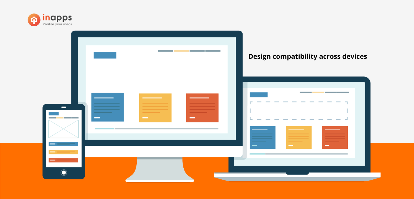
As a general rule, the necessary content is fully displayed on one screen for users to grasp information fully and quickly. Experts also encourage UX Designers to restructure content so that users don’t need to scroll down.
Moreover, it is very convenient on the computer interface to switch tabs, return to the previous page or compare the information. However, the phone screen is relatively small, and browsers/applications have many limitations when performing operations. UX Designers need to restructure information and aim for one page – one action instead of leading the user through too many pages.
Objective conditions
Problem 1: Suppose a user fills out the information on a mobile application and disconnects the connection due to unstable Internet. In this case, are the actions the user is currently performing stored, or do they need to perform them again?
Problem 2: Users are easily distracted. They often use their phones in distracting environments. Does your web/app capture users’ attention in those environments or make users remember the actions they want or are in the middle of doing?
These are two problems posed for UX Designer and Developers to improve the experience and increase user interaction and usability.
The way that users hold the device
According to research by Steven Hoober (founder of Studio 4ourth Mobile) in Kansas, USA, users have different interaction behaviors in different phone holding positions. Accordingly, users have 6 common ways of holding and using two fingers (thumb and index finger) to perform operations.
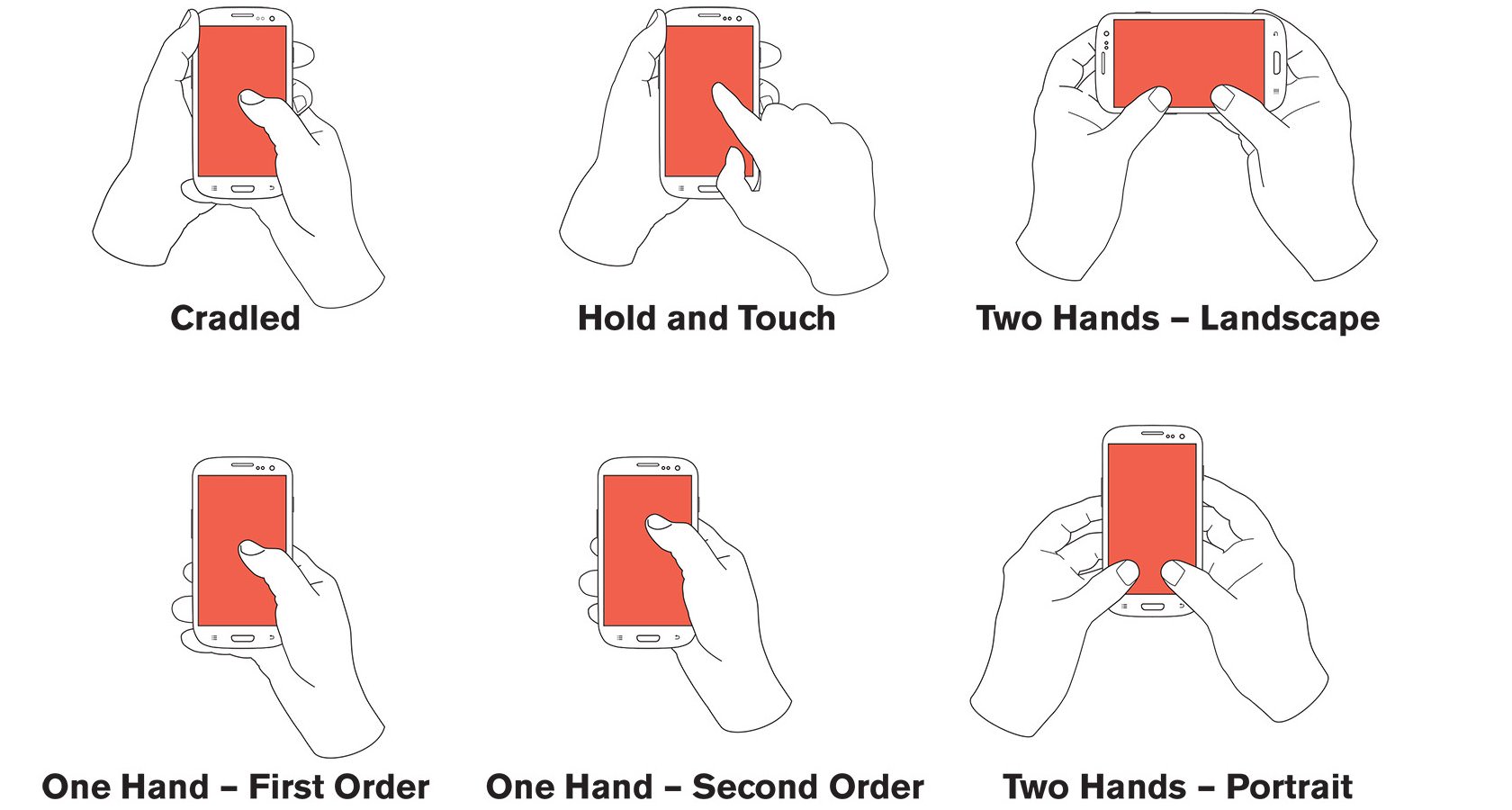
When using mobile phones, users can often change the holding position. But in any case, they focus on the center part of the screen and don’t like clicking on items too close to the edges.
How to optimize the Mobile UX Design?
Following are the best tips for UX Designer and related partners in the project to increase the mobile user experience.
One size fits all
According to Hoober’s research, you should remember the “One size fits all” formula. One size for all phone types of all sizes, for all different users. Be aware of the layout, content, and functions suitable for all users’ behavior and devices. As for the font standard, the minimum size should be 11 for all styles to ensure the user’s eyesight.
The best position is the center
Please note that users always prefer to click in the center of the screen in all cases. UX Designers must also consider the cases where the user rotates the phone screen or holds it in different ways.
CTA (Call to action) can be located in many different positions when the user rotates the screen horizontally or vertically. However, in the experience of experts, the best position is still near the middle of the screen, not too close to the two edges.
Read more: 04 Tips to optimize dashboard icons.
Ideal size for a navigation tool
According to a study at the Massachusetts Institute of Technology, USA (MIT), the ideal size for these elements should be 7-10 mm wide, not smaller. On the contrary, if the size is too large, the design has asymmetry, affecting aesthetics and focus. In addition, the UX Designer needs to rely on the behavior of holding the phone to avoid user finger positions that could obscure content or navigation tools.
Maybe you don’t want to miss: 06 Tips to optimize the search bar design.
Tips to Work with Developers
Developers will take over the work of the UX Designer and implement the next step for the project. Therefore, effective communication, conveying the correct meaning of the design is a necessary skill. Here are a few helpful tips:
Detail the mockups
When preparing and handing over Mockups, UX Designers need to complete them carefully before handing them over to avoid editing small details that waste time. Mockups need to have clear, consistent names and detailed descriptions of the ideas when the website/app goes live.
Detailed Notes on features
A page of a website/app has many buttons to navigate, the link between pages, and open different functions. UX Designer should create a blueprint – a stratified plan of the sequence of events and actions to achieve a goal that architects and managers often use to share their plans with colleagues. With this blueprint, developers will understand how the website/application will be operated according to the process.
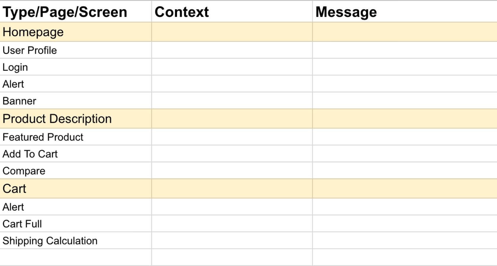
Describe the design logically
When creating a blueprint is based on the design of each page, UX Designer can logically design according to the work item, the context, and the message, response of the website/application as below.
Read more: Mobile design and development checklist
Wrapping Up
We hope this article helps you break down barriers in Mobile UX Design.
Check out our PORTFOLIO and CLIENTS’ SUCCESS STORIES
[sociallocker id=”2721″]
List of Keywords users find our article on Google:
| mobile game ux designing company |
[/sociallocker]
Let’s create the next big thing together!
Coming together is a beginning. Keeping together is progress. Working together is success.


