- Home
- >
- Mobile apps development
- >
- Mobile App UX Design: A Quick Introduction (2023)
Introduction
Mobile apps have taken the world by storm for years, capturing users’ hearts everywhere. In fact, 67% of people now prefer using mobile apps over clunky mobile websites. But here’s the catch: in today’s fast-paced digital landscape, the success of an app hinges on one critical factor — user experience (UX) design.
It’s all about creating apps UX design that makes users go “Wow!”. Optimizing their interactions, streamlining navigation, and simply blowing their minds. Let’s uncover the true significance of UX design in app development, and how it can shape the ultimate user experience.
The Role of Mobile App UX Design
App UX Design Overview
UX design is the secret that spices up user satisfaction. It’s all about making users happy, that’s why developers work their best on improving usability, accessibility, and overall app-user interaction. Think of it as a symphony of visual design, information architecture, and expert UI craftsmanship.
As developers put users at the heart of the design process, UX design aims to create apps that are not just user-friendly, but downright addictive.
The Impact of Good UX on App Success
Here’s the kicker: good UX design can make or break an app.
When users have an out-of-this-world experience, they become true app enthusiasts. They’ll engage with your app like there’s no tomorrow, talk about it to everyone they know, and become loyal customers.
But that’s not all! Satisfied users won’t just spend quality time with your app; they’ll engage with your brand and products as well. That means more conversions, more revenue, and a big ol’ slice of success. By focusing on UX design, you’re not just joining the race; you’re leaving your competitors in the dust.
User-Centered UX Design Process
By following this action-packed journey, app developers can gain mind-blowing insights into user needs, preferences, and pain points. They can design apps that users can’t resist!
The Importance of User Research
User research goes beyond surface-level interactions. It’s all about getting inside the heads and behaviors of your targeted users. Take the time to look into their motivations and challenges with deep consideration and research. This will lead to the successful creation of an app experience so personalized that users will think you can read their minds. It’s like a magic potion that transforms your app from underwhelming to magnificent.

Wireframing and Prototyping
According to a survey by UXPin, 80% of app developers believe that wireframing and prototyping improve the overall design process and help identify potential issues early on. These dynamic duo techniques bring your app to life and deliver mind-blowing results:
Wireframing: The “Blueprint”
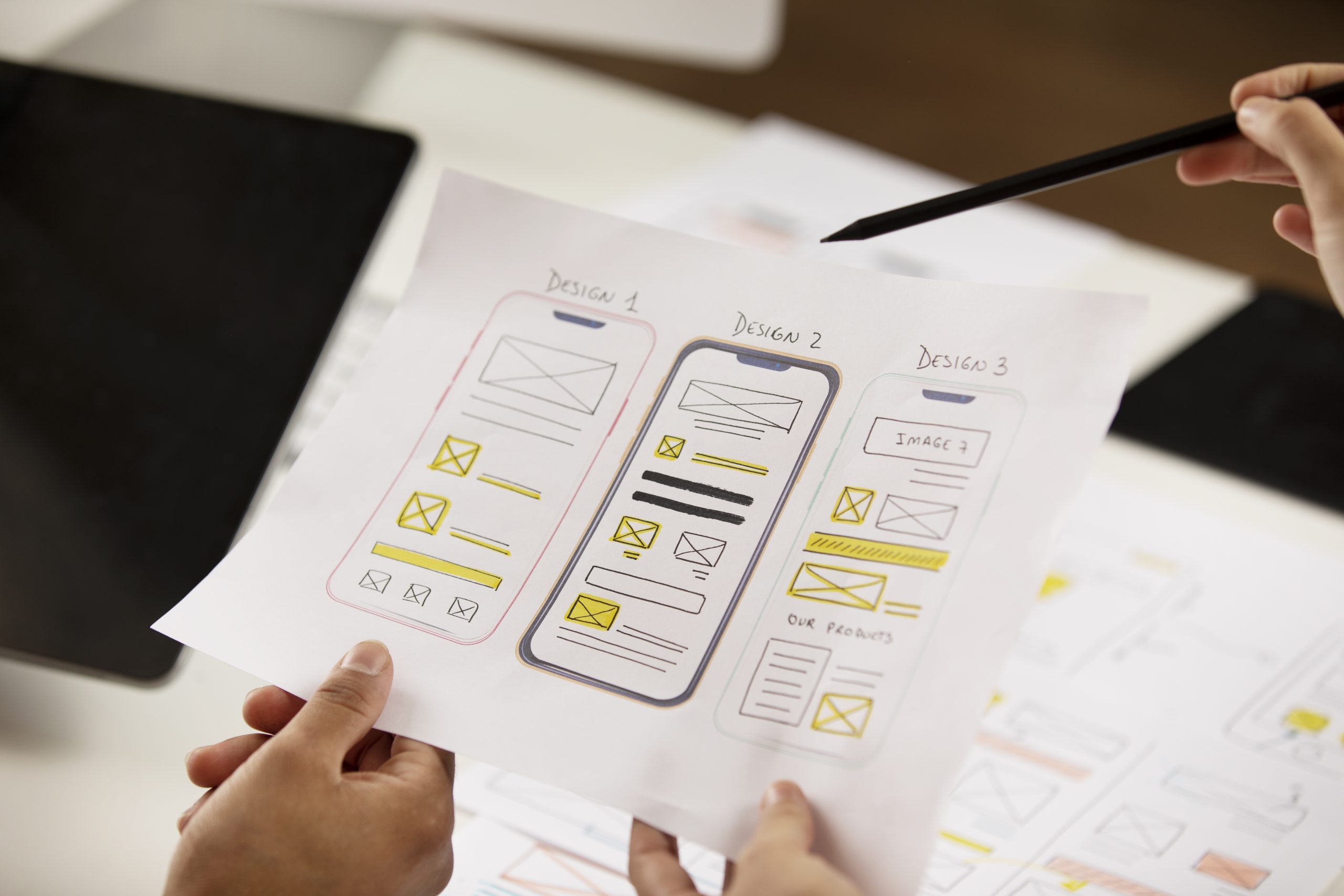
Wireframing, often also referred to as “blueprint”, serves as a framework for orientation for application development. It provides a solid foundation for creating low-fidelity representations of your app’s UI and functionality. You can define the design, structure, and user flow of your application from the start.
With the wireframe as a “bird’s eye view” of the entire application structure and hierarchy, you can visualize the overall basic structure of the application. You can also identify key elements, such as navigation menus, content location, and interactive features.
Having these elements in place early in the design process, the process to optimize user interactions and overall usability will definitely improve later on. Wireframing uncovers hidden knowledge and potential pitfalls, saving you time and resources in the long run.
Prototyping: Refine to Perfection
Once the wireframes have laid the groundwork, prototyping can take the next step.
With prototyping, you can refine your application to the point of perfection. Try interacting with a virtual prototype of your app, it’s pretty much like putting yourself in the shoes of your users and experiencing the functionality of the app first-hand.
Prototypes are high-resolution, interactive versions that closely resemble the final product. They provide previews of your designs, complete with simulated interactions, animations, and realistic transitions. You can show your prototype to stakeholders and customers, and showcase the future possibilities of the app.
Valuable feedback can be taken from the prototype. You can gather information and further develop your design based on the feedback you receive. This feedback loop allows you to address any concerns or issues before you start development.
User Testing
User testing is a crucial step in the UX design process, during which real users evaluate your app after you have created a wireframe and a prototype. App developers will be able to discover valuable insights about the overall experience: how users feel, think, and act when using the app.
This procedure is vital, users will directly expose to the prototype of the app, the earliest stage of the whole development process. This will lead to identifying and optimizing any usability issues that might affect their experience.
Key Principles of Effective UX Design
Simplicity, Consistency, and Responsiveness
One of the key principles of effective UX design is simplicity, consistency, and responsiveness. This means that your app should be:
-
Simple to use,
-
Have a consistent and logical design,
-
Adjust to different devices and situations.
Following this principle, you can create a user-friendly and engaging app that meets the needs and expectations of your target audience. But don’t just take our word for it. Statistics have shown how these 3 fundamentals can make your app more successful:
-
Conversion rates show how well your app meets the users’ goals and needs. According to Forrester, better UX design can boost your conversion rates by up to 400%. More users will do what you want them to do on your app, like signing up, buying something, or subscribing to a service.
-
Based on a study by Stanford University, simplicity in design allows your app’s credibility to increase by 75%. Users will be more likely to trust your app and think of it as more reliable and professional.
-
According to Google, responsiveness in design can lower your bounce rates by 53%. Fewer users will leave your app after seeing only one page or screen. It proves how well your app keeps the users’ attention and interest with optimized responsiveness.
Let’s look at a case study that follows simplicity, consistency, and responsiveness: Spotify.
Spotify – the music streaming app with millions of songs, podcasts, and playlists. Spotify has a minimalistic interface that focuses on the content and eliminates unnecessary distractions. It also follows a clear and logical layout, which prioritizes consistency throughout the experience, and makes it easy to navigate. Spotify is responsive, with many adaptations to different devices and contexts, such as desktop, mobile, tablet, car, TV, or speaker.
Simplicity, consistency, and responsiveness are not just nice-to-have features, but essential ones for creating an app that delivers a satisfying user experience.
Designing Intuitive Navigation and Engaging Interfaces
Another key principle of effective UX design is designing intuitive navigation and engaging interfaces. This means that your app should be:
-
Easy to find,
-
Easy to explore,
-
Easy to interact with.
The first principle is more about the overall design of the app, while the second principle is more about the specific features and functions.
You can create a user-friendly and engaging app by applying this principle and helps users achieve their goals and tasks. But how can you measure the impact of this principle on your app’s success? Let’s take a look at some “talking numbers”:
-
Intechnic reports that a good user interface can increase website conversion rates. It is possible to reach up to 200%, while a bad user interface can harm a brand’s reputation.
-
According to Princeton University, there was a success rate of 80% when people used the navigation scheme structured according to most users’ mental models. The success rate was only 9% when it was completely according to the company’s internal thinking.
-
Bluespace states that 39% of users will stop engaging with content when the images won’t load or the loading time takes too long. This indicates the importance of engaging interfaces.
Enhancing App Usability and Accessibility
Last but not least, enhancing app usability and accessibility. The app should be developed to be suitable for all users, whatever their abilities or preferences are. It fulfills the requirement of being simple and inclusive for users to accomplish their goals and tasks.
Here are some ways to apply this principle:
-
Usability and accessibility guidelines and standards: some of the applicable standards can be Nielsen’s heuristics, ISO 9241, WCAG, or ADA. These guidelines can help you design interfaces that are easy, consistent, and efficient for users.
-
Measure and improve usability and accessibility: Always keep this in mind to evaluate the effectiveness. For example, you can use conversion rates, bounce rates, or return rates to check how well your app performs and how much users enjoy it.
Duolingo is a noteworthy case. It is a language-learning app that lets users learn different languages through engaging lessons and games. Duolingo is usable and accessible thanks to its simple and intuitive interface. The app also supports other languages, devices, and learning modes. A highlight of the app is Duolingo follows the Web Content Accessibility Guidelines (WCAG), which ensures that its app is accessible to people with disabilities.
Calculating UX Design Efficiency
When it comes to measuring UX design effectiveness, there is really no definitive answer. Different companies may have different goals, methods, and metrics. However, some common ways that tech companies measure UX design effectiveness are as follows:
-
Usability metrics: These metrics evaluate how easy, effective, and enjoyable the product is for users. These include task success rate, task completion time, error rate, and customer satisfaction score.
-
Behavioral metrics: such as pageviews, bounce rate, conversion rate, retention rate, and churn rate. You can track and analyze how users interact with the product, and see how engaged they are.
-
ROI metrics: These revolve around revenue, profit margin, customer acquisition cost, customer retention cost, and customer loyalty. Why ROI? Because it is vital to measure the return on investment of the product design, evaluate how much value it generates for users and the business.
-
Qualitative methods: collect interviews, surveys, feedback forms, reviews, and ratings. These metrics directly gather user opinions and feelings about the product, which can be valuable in terms of identifying their needs, preferences, and pain points.
-
A/B testing or multivariate testing: Compare different versions of the product or its features. You can determine which one performs better according to the chosen metrics.
By using a combination of these methods and metrics, you can measure UX design effectiveness and improve the app’s UX design based on user feedback and data.
Conclusion
Mobile app UX design is not just about making your app look good – it’s about making it work well for your users! Whether they are using a smartphone or a tablet, in portrait or landscape mode, etc. It is undeniable that UX design allows the app to provide a seamless and satisfying experience.
Moreover, measuring how well you achieved your goals is a must to see how well the app is performing. Choose suitable metrics for your application, from usability metrics to A/B testing. These will help you evaluate your mobile app’s performance, user satisfaction, and business impact.
Let’s create the next big thing together!
Coming together is a beginning. Keeping together is progress. Working together is success.


