- Home
- >
- Mobile apps development
- >
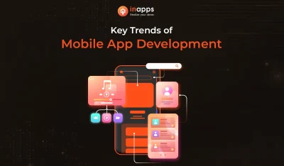
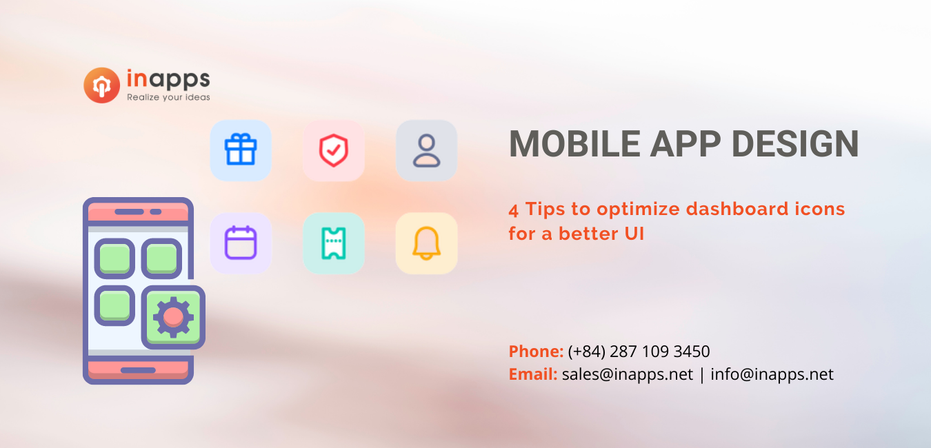
- [MOBILE APP DESIGN] 4 TIPS TO OPTIMIZE DASHBOARD ICONS FOR A BETTER UI
A clean and clear mobile app design is always welcome! This means that you need to maintain a nice user interface without compromising the intrinsic data/information, including dashboard icons. The dashboard icons are like the backbone. They’re the first things your users see.
Typically, people think that dashboards are all about text and charts, but the third facet of dashboard layout is the “icons.” Placing familiar and easily accessible icons such as “Save,” “Delete,” “Open,” or “Hide” will make your dashboard design stand out. Users know where to click to take a certain action, which makes for a great user experience.
Thankfully, for all those who’ve been wondering how to optimize Dashboard icons, here are the top 4 ways that help better user interface.
Why are icons on Mobile App design important?
Icon factor is often used on mobile interfaces. The icons are intended to make it easier for users to navigate through the user interfaces. Nowhere are they more common than on mobile dashboards.
You can use them to draw attention to the information, indicate an area, or represent different tasks. When performing actions, icons become buttons. In addition, if the icon is well designed, you can improve and speed up the user’s information processing process, and vice versa, they may hinder the user in the experience.
Dashboards contain several icons in a compact area. This increases the cognitive burden on the user to perform tasks. Users may find it difficult and time-consuming to navigate your application when your grouped icons aren’t optimized for visual search.
When users browse a group of symbols, they need to identify their target symbol quickly. Therefore, designers need to optimize the design of icon sets to optimize the user’s information search time on the page.
04 Tips to Optimize Dashboard Icons for a Fast Visual Search
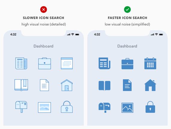
Visual noise
The more detailed an icon, the higher its visual noise. Visual noise increases sharply when users encounter a series of detailed icons at the same time. Finding and choosing an icon will take more time because users will be “exhausted” because of considering the detailed lines and shapes of an icon.
On the contrary, a minimalistic array of icons can reduce visual noise, allowing users to find and select icons quickly. The internal details are reduced to a minimum, so the icon’s shape becomes more prominent and easily recognizable.
Research shows that users can recognize minimalist icons faster than detailed icons. However, when icons are excessively minimal, they will confuse users. There are always certain characteristics of an icon that evoke awareness. So you should not ignore those details.
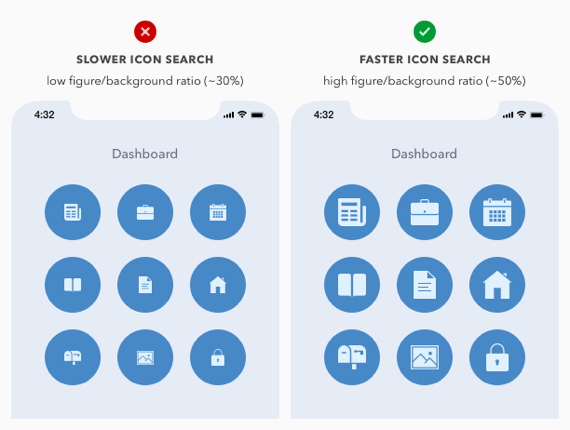
The ratio between icon and background
Another factor affecting the user’s icon lookup speed is the ratio between the icon and the background. A low icon/background ratio will make the icons appear smaller and difficult to distinguish on a large screen. So users are forced to enlarge the screen to see the difference between icons, thus increasing the time and effort when searching.
When this ratio is high, the icon size will become larger and clearer on a large screen. Users will not need to enlarge the icons because they can completely recognize them immediately. This helps users reduce perceived effort and speed up information search.
A study shows that when this ratio is at least 50%, it improves search time, and most users prefer it. At the same time, placing the icon on a circular background will also speed up the search process.
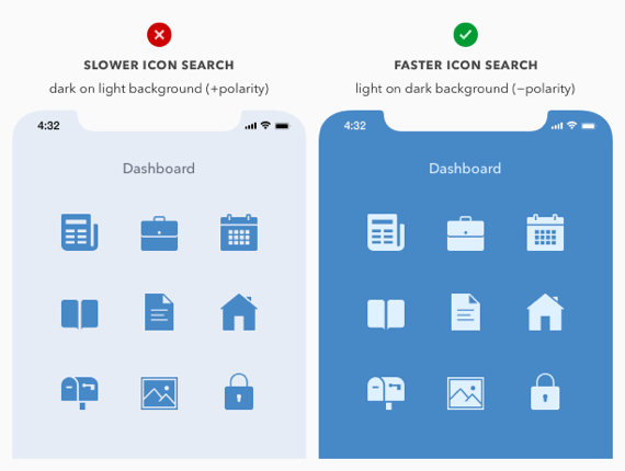
Dark mode Vs. Light mode
Positive icons are represented by choosing a dark color for the icon on a light background. They make the search process slower than negative polar icons (light color on dark background).
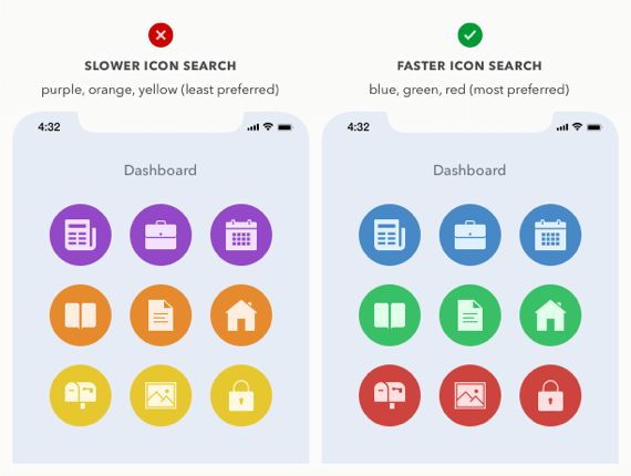
In the image below, the icons in both panels have similar elements. But the negative polarity icons in the right panel look a bit larger and clearer than the positive polarity icons. Visual clarity will allow users to find and identify icons more quickly.
Research shows that most users prefer negative polarity icons. This is closely related to the high contrast between the outer shapes of icons and their internal details.
Most Preferred Colors
Icon color can also speed up the visual search process and grab attention, making the target stand out more. Users can quickly recognize icons with familiar colors rather than icons with only black and white two colors.
The icons in the board design are supposed to be a colorful saga that ultimately attracts users with its charm. But there is a catch here! It would be best if you chose color combinations with the greatest attention to detail. In fact, the right colors work in harmony to make the visual search faster. According to a study, the combination of “red,” “blue,” and “green” turns out to be the most preferred.
Interestingly, blue, green, and red are the dominant colors on computer monitors and other display devices. This makes those colors more realistic, while purples, oranges, and yellows don’t really stand out. In addition, familiarity is also a factor that makes these colors the optimal choice for icons.
In practice, our app may have certain branded colors that you need to use, or your app may need to use a light or dark background for your content type.
Final word
In any case, use these recommendations as guidelines. The tips above will prove to be the best practices available so far.
However, never absorb these tips without fully understanding the preferences and expectations of your end-users. So never ignore the power of a good panel design, as a poor panel UI design can cost you a lot.
These guidelines apply not just to dashboards but to any navigation that uses icons.
Maybe you don’t want to miss: 06 tips to optimize the search bar design.
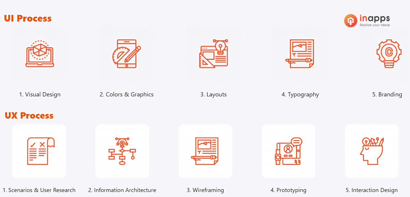
Mobile App Design Process
If you follow a mobile app design process with a user-centered mindset, you can ensure that you are creating a usable and useful product.
Read more: Mobile design and development checklist
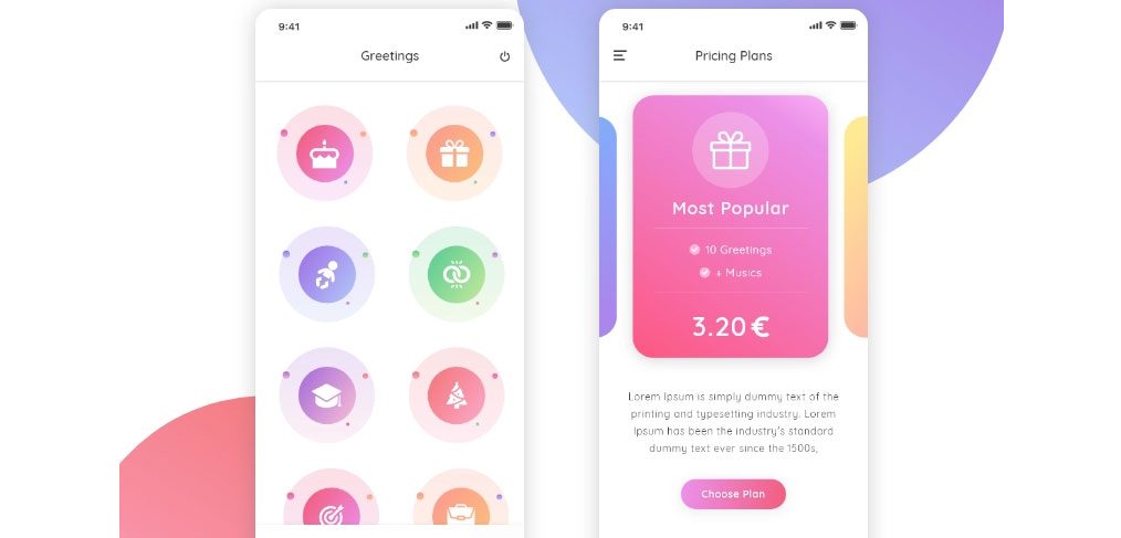
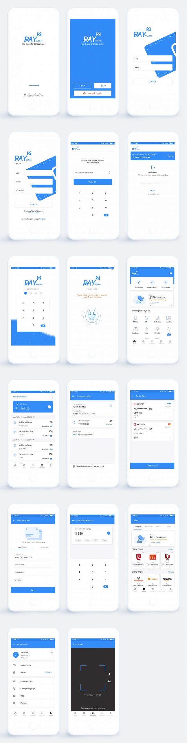
Mobile App Design Examples
Let’s take a look at an eWallet app designed by InApps. And don’t hesitate to contact us to receive a proposal about the project. We have a special promotion program just for you this month that is a FREE UI DESIGN worth up to 3,000 USD.
Learn more: How to develop a dating app like Bumble?
Offshore Development Center for mobile app design in Vietnam
In recent years, Vietnam has been the destination for IT outsourcing thanks to the competitive labor costs compared to other countries, a large pool of IT talents with foreign language proficiency, and open policies regarding foreign companies of the government.
- Ho Chi Minh City in Top Outsourcing Cities in 8 consecutive years (Tholons, 2009-2016)
- Vietnam is ranked 1 in pioneering location and cost environment (Cushman & Wakefield business process outsourcing and shaped service location index, 2016-2017)
- Top 10 countries with the most engineering graduates (Forbes, 2015)
Reliability is one of the elements to make the best decision! Hence, we shall show you our reputation via Our Case Studies.

Let’s create the next big thing together!
Coming together is a beginning. Keeping together is progress. Working together is success.