- Home
- >
- Mobile apps development
- >
- Adobe XD vs Sketch – Which is Designer’s first choice?
Adobe XD vs Sketch – Which is the best choice for designers?
UI/UX designers were and are highly in demand, 2022 is no exception. So which tool do designers prefer for enhancing their design? We will conclude with a healthy comparison between Adobe XD vs Sketch. Let’s see which one is the most prominent tool.
Yes, we are talking about Adobe XD and Sketch, both have immensely contributed to delivering the ultimate user experience. Although they both have the same objectives but have different ways.
Let’s shed some light on how differently they work and which one is the designer’s first choice.
Adobe XD vs Sketch – Overview
” Design at the speed of light “
Adobe XD’s tagline says it all. XD is made for designers, creative teams and organizations that need to design at scale. It’s everything( Wireframe, design, prototype, present and share amazing experiences for web, mobile, voice etc) you need to work more efficiently, collaborate effortlessly, and create and manage your design system.
“The best products start with Sketch”
Sketch offers you to create, prototype, collaborate and turn your ideas into incredible products with the definitive platform for digital design. With sketch’s smart Layout you can create responsive, reusable components that automatically resize to fit your content.
Why Adobe XD?
“Adobe XD” developed and published by Adobe Inc. XD is a vector-based user experience design tool for web apps and mobile apps, available for macOS and Windows.
There are versions for iOS and Android as well that help to preview the result of work directly on mobile devices. XD also support website wireframing and creating simple interactive click-through prototypes.
With the character and layout tools of Adobe XD, Elements can be easily created and the individual objects can be exported.
Note: A beta of Adobe XD was released for Windows 10 on December 13, 2016. On October 18, 2017, Adobe announced that Adobe XD was out of beta.
XD is a lot more intuitive and easier to use than other Adobe applications. This facilitates a great introduction and creates a good user experience right from the start. The Adobe Design Library Manager makes the workflow of creating design assets seamless.
Adobe XD: Most Liked Features
“Through integrations with Creative Cloud we can make our customers happier and more productive by connecting them seamlessly to all the services they use, and an endless supply of tools that extend our applications in powerful and custom ways.”
-Vijay Vachani, Director, Head of Partner Platform & Ecosystem, Adobe Creative Cloud.
The beauty of Adobe XD is its learning curve that is light and occurs mostly around a more complex design system and symbol overrides. XD handles complex design systems and symbol libraries. It also features intuitive tools for easily connecting screens and creating interactive prototypes that can be utilized in user testing without the need for code. Its auto-animate function makes prototyping rich interactions even easier by automatically animating micro-interactions.
“Adobe XD benefits include the wide-availability of plugins and add-ons.”
The Interface
The interface is kept relatively simple and looks a bit like Sketch, with the toolbar that is aligned at the side, as well as the large artboard area.

Testing On Mobile Devices
With Adobe Experience Design, Interactive designs can also be displayed on a smartphone or tablet. You can view the prototype on different devices and easily share it with your team and customers.
Designing With The Repeat Grid
Elements can be selected and repeated as needed using the new repeat grid. The changes are applied to all areas.
New Animations
With Adobe XD, you can experiment with new types of transitions on the design. The two options are “no transitions” or “move into“.
Quick Drag & Drop
Here you can insert pictures directly from the Finder by simply drag and drop. Xd will automatically create an image mask. Pictures can also be imported comfortably via copy and paste. This also works for vector graphics and can be edited in Adobe XD as well.
Adobe XD Benefits
Target Audience
You can immediately notice that the product is indeed intended for interface designers. For example, the Repeat Grid tool is amazing, it allows you to create content grids such as post lists, inventory catalogs, and user tables, very quickly.

Integration
XD is fully integrated with other Adobe’s products, so you can quickly copy assets from photoshop or illustrator and then paste them into Experience Design.
Content Recognition
It feels like XD recognizes the type of content you are trying to drag-and-drop in it. For instance, if you drag-and-drop an image from Finder on to the required object in Experience Design, the app will automatically make an image mask for this object.

Prototype Mode
“The auto-animation tool used in an Adobe XD prototype”
You can notice that connecting screens is done much easier in XD than in InvisionApp. With Invision you are forced to choose them from long lists. You can also set parameters for each transition between screens to define its type, duration, and dynamics.

Prototype preview
XD allows sharing prototypes by uploading them to Adobe servers so that you could then get a link and send it to, say, a client for demonstration.

Adobe XD: Flaws
- Lack of layer panel
In XD if your screens are overloaded with elements, you may find it hard to reorganize existing objects. - Limited tools for creating new graphics
It doesn’t look that important after considering the fact that you can import existing assets from Photoshop and illustrator. - Absence of styles and symbols
These are highly effective in Sketch. - Low layer effects
You will barely find any layer effects Drop Shadow. Which again is a minus if compared to sketch.
Adobe XD: Price
Adobe XD is a part of the Adobe Creative Cloud subscription, which gives you access to over 20 apps like photoshop, Illustrator, Premiere Pro, etc for $ 50 per month.
It’s hard to separate the price specifically for that product. In May 2018 Adobe announced a starter plan that allows the use of Adobe XD for free. It’s limited to only one active project.
Note: During the Adobe MAX conference, there were several important announcements around plugins, UI kits, and app integrations to expand Adobe XD’s utility. $10 million Design Fund for this exact purpose proves the importance of supporting plugins and incentivizing developers to create them.
Designers working with a variety of companies and on different projects will most likely need a spectrum of problem-solving skills. A broader design toolbox can be a big advantage.
Adobe XD is fast, free, and easy to learn. There is nothing lost in taking the plunge and expanding your versatility.
Why Sketch?
Sketch is primarily used for designing UI and UX of mobile apps and web. The files designed in sketch are saved with its own extension .sketch file format. You can also save these images in popular extensions like PNG, JPG, TIFF, WebP, etc.
The designs created in Sketch are utilized by app engineers to design mobile apps and by websites developers, to design websites.
“The idea of the founder was to produce a simple drawing application to support his income while studying, which became widely adopted by designers.”
Sketch was previously sold through the app store but in December 2015 developers pulled the app from the store and instead sold it through their own website. On 8 June 2016, Bohemian coding announced on their blog that they were switching to a new licensing system for Sketch.
Sketch: Most liked Features

Non Destructive Editing
There were days when an image is destroyed for good once a change is made to the original data. With Sketch, digital artists can apply any modifications to their image and still revert to the original or previous iteration when they need to.
Exporting Feature
Sketch is not limited to its own functions, it enables designers to further refine or use their creations in other applications by letting them export codes and presets.
Grids & Guides
The designer can be particular with object alignment. This is why the application comes with grids and guides that lets users place and move objects around with precision.

Reusable Elements
Sketch comes with Symbols, It’s a feature that allows users to create icons, avatars, and other design elements and save them for future use. So they do not have to repeatedly create these elements on other sections of their design and still customize them as they wish.
Collaborative Platform
Sketch allows for the collaboration of teammates. It does this with its Libraries, where designers can share their symbols and use the elements uploaded by others for their own tasks. It allows everyone to stay updated regarding the progress of projects.
Community Support
With Sketch, users can do away with long emails and delayed support. They can easily post their concerns on Sketch Cloud and receive immediate feedback regarding their concern.
Sketch Benefits
Simple Yet Effective
One of the greatest benefits of Sketch is its simplicity, it is easy to use and easy to pick up the basics. Its refreshing just how it is to navigate even for newcomers.
Powerful Tool
Powerful and effective tool for general layout and vector drawing. So it’s a relief to have something like Sketch to not only save time, but also stress and, most importantly, money.
Multiple- Resolution Assets
Sharing and exporting multiple-resolution assets is incredibly simple. The ability to re-use elements with ease, again and again, means that you can save hours of your working time as a designer.
Integration
Superb integration with other apps and plugins. Sketch isn’t a standalone app that requires extensive procedures to bring all your work together, it facilitates almost seamless integration with the likes of Principle, Framer, and Marvel.
Layouts
Layouts and vector drawings are as powerful and simple as they should be, so it’s a pleasure to get stuck into, even if you want to spend more time experimenting.
Affordable
It’s a wonder Sketch is so cheap at a one-off payment of $99 (including free updates for a year). It’s certainly saved me more than that on my projects.
Sketch: Flaws
- Quite buggy:-
Sketch does have its downfalls. One of the most infuriating is its susceptibility to bugs and glitches. - Unexpected Crashes:-
Even after updating to the latest version, you will experience unexpected crashes with the app and its associated plugins. - It’s Mac-only:-
At the moment, it’s only developed and updated exclusively for Mac users. - Difficult to use with a Wacom tablet:-
It’d also be great to see it expand its reach and usability on the Wacom tablet, too. It’s currently quite difficult to use due to the panning issues and generally convoluted experience.
Sketch: Price
Sketch offers a single enterprise pricing plan for all users. Here are the details:
Mac- $99/one-time payment
- One Year Free Updates
- Mirror App
- One Year Free Sketch Cloud
- License Management
Licenses are renewable and extendable to accommodate more users. Students, teachers, and staff can avail of a 50% discount. Academic institutions can acquire the application at no cost.
Adobe XD vs Sketch: Designers Preference?
Designers these days are expected to have a mix of both creativity and digitization, in their designs. The designer can achieve this objective with good design tool. Staying with UX and UI design, we have seen Adobe XD and Sketch grow up as the most preferred though Adobe XD is relatively new while UX sketch has been around for a while.
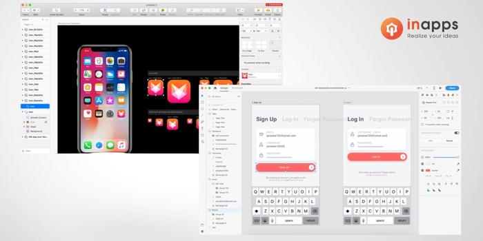
- When compared to Sketch, Ui designer may not find too many changes in the first look of Adobe XD.
- Adobe did not adopt the darker buttons and menus, Adobe comes with taller layer panels and properties, to the right side of screens, as seen in Sketch.
- Adobe is considered to have a slightly more user-friendly approach and is quite easy to learn and understand.
- Repeat Grid is one of the unique features of Adobe XD, This feature saves a lot of time for the designers when you have to design pages or screens with lists of repeating elements.
- Adobe provides the facility for generating interactive prototypes through its vector drawing ability which can be easily shared across the web. However, Sketch would require the services of plugins to perform this activity.
- Adobe included the Assets panel, a way to bring together an interactive style guide with colors, character styles, and symbols. Sketch also has a color variables, characters styles, and symbols, and everything, but each one contained in their own panel.
- Responsive Design, a highlight feature of Adobe XD is soon to be introduced feature in Sketch, for a native app.
- Both Sketch and Adobe XD support common file extensions while exporting and importing files. Comparatively, Adobe XD supports files with extensions PNG, SVG, and PDF while exporting files and JPG, GIF, PNG, TIFF, and SVG, while importing files.
- Both Sketch, as well as Adobe XD, extends offline support to designers.
- Supportive tools like Sketch and Adobe XD also support the use of symbols. While Sketch supports the use of reusable symbols with responsive resizing, Adobe XD supports only basic symbols with no responsive resizing facility.
- While Sketch works well only on MAC Platforms, Adobe XD works fine with MAC as well as Windows 10 platforms.
The goal of a designer is to listen, observe, understand, sympathize, empathize, synthesize, and glean insights that enable him or her to ‘make the invisible visible.
If you need any more consultation, feel free to fill in the contact form below or explore our website for more services.
List of Keywords users find our article on Google
Let’s create the next big thing together!
Coming together is a beginning. Keeping together is progress. Working together is success.


