- Home
- >
- Web Design & Development
- >
- Web Design Process in 2023 – Fundamental Guideline
If you’re a newbie in web designing and you are wondering how to handle an entire web design process. This practical guideline with the latest updates will help you be ready to conquer your debut project.
Web design is a fundamental part of the web development process. We all know web designing is like building a functional piece of art. Therefore, it is understandable that the web design process includes many things for web design developers to keep in mind.
However, where to begin with and the real question is what you require to know before heading further. Here we have this complete fundamental guide to help you out.
Essential Guide To The Process Of Web Designing
A comprehensive guideline on the web design process special for newbie. You are at the right place to learn the basic fundamentals of web designing.
1. You have to pick something basic for your initial design
At the beginning of the web design process, a newbie sometimes might get over-enthusiastic and put many expectations on his project.
However, it turns out that most of them face many challenges during the process of web design and finish up with disappointment.
Therefore, to avoid that situation, it’s a superb idea for you to pick something easy and a little fun.
It’s suggested that a blog is an ideal platform to getting started. You will learn good design skills and how exactly a Content Management System (CMS) runs, which will be essential to understanding and preparing for your upcoming website designs.
But most importantly, with a project like this, you don’t have to build everything from scratch. Instead, you will get a hub of templates that will turn it simple for you to put one together.
Indeed, templates are helpful tools for learning from doing. Moreover, you can see the way how CSS, HTML, and JavaScript are styled and integrated which shows you the answer to what really makes a design work.
You can choose some templates as a brick to make a few alterations and customizations.
In case a blog is not something that you wish to commence, you might love to create a project related to your innovative hunts or hobbies. Building a design to display a passion of yours will make your initial project fun.
2. Let other designers inspire you
There are plenty of websites with many works that will wow and ignite your creativity. Before starting your project, you can create your own “inspiration board” to save all the works that suit your taste and become a fleet reference resource.
Pinterest, Behance, and Freepik are some inspiring websites that are worth your click. You can find several pins graphics, posters, covers, blogs, and other sorts of design work that you can refer to.
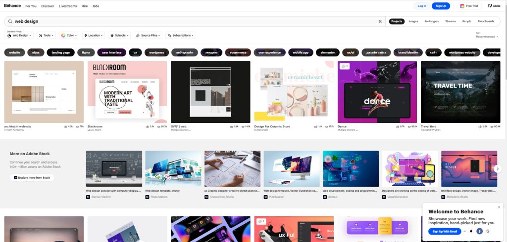
Apart from all the discoveries that you create on your own, the following are some well-formed collections that you should look out.
- Awwwards comes up with some forever fresh stuff that you are looking for with a great variety of themed collections.
- Behance is indeed a splendid collection of website design work, where the entire focus is on innovation and quality.
- Dribbble is individual and designer-centric and offers a forum to get good feedback and communicate with others regarding their work.
3. Search for more sources outside the web
You can get inspiration from almost everywhere you want. Web design is notified by a visual language that can be seen everywhere, like a graphic novel’s cover.
So, start searching for a great design and begin analyzing why something works well or doesn’t, whatever the way.
Pay more attention to typography
We often read without paying attention to typefaces. Next time instead of screening through the content, spend a few more seconds thinking of the font. Are they readable? How do they style and combined? We see letters everywhere we go. So, ensure you have all your observations well noted since those notes will be valuable resources for you in the long run.
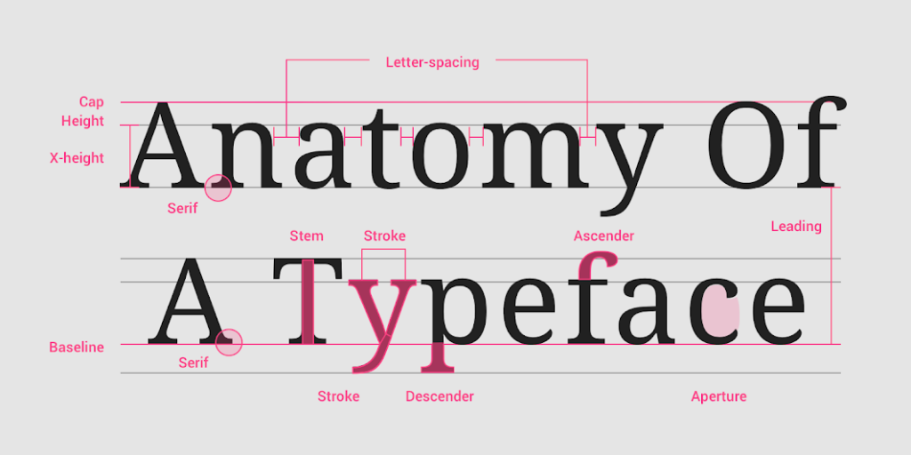
When coming to typography, Typewolf is a great resource to keep tabs on famous fonts.
It provides a plethora of lists to explore, lookbooks with the best font combinations, and a featured website of the day. It is extremely helpful to view exact typography examples being employed, and a few websites like Typewolf is a great platform to view their practical applications.
Getting a little more familiar with a variety of fonts will assist you to find out the correct type during the web design process.
4. Study different sorts of design
To be a web designer, you should know different design principles. Thus, having a good knowledge of illustration, product design, and branding can later contribute to your innovative senses.
For collecting inspirations that are beyond web designing, Abduzeedo is totally a platform that you wish to have a look. You will come across various great examples of design, regardless of whether they’re luggage, poster art, or furniture. So, be more open to various sorts of design and actively get more inspiration.
The more knowledge you have, the simpler your web design process will become.
5. Get ready with your content before you begin
Starting with putting a content list tells about having content ready to work with as you begin designing your initial website. It doesn’t have to be great and you can anytime edit and optimize it for Google SEO further. However, having at least a rough content of what will be live for the audience will assist in ensuring the design is made out to support it.
Designing your website with some real content provides you with a good display of how the website will appear and work. It also offers you the opportunity to make hefty changes earlier in the process of designing.
If you are doing it for blogs, then you will require to have a post ready to first test in the CMS. You should have a bunch of posts already written before you go live and it will save struggling to write something after the fact.
6. Keep your design less for more
Whether it’s the matter of CTAs, writing, or navigation, no one would wish to struggle with your web design. Your approach to design should be fitted in simplicity and order.
There should be some logic that would guide someone via the website with comfort. Moreover, since we are discussing those people who will deal with what you have made, this is a great place to come up with UX.
7. Understand user experience (UX)
A website is not a single block of text, there are many other things to consider as well such as typography, color scheme, layout, content, and imagery. Those elements closely link and directly affect the audience’s emotions.
UX mainly puts focus on knowing your audience better. What are they searching for on the web – and how will your design make their work simple? UX is all about reaching your audience and viewing your design through your eyes.
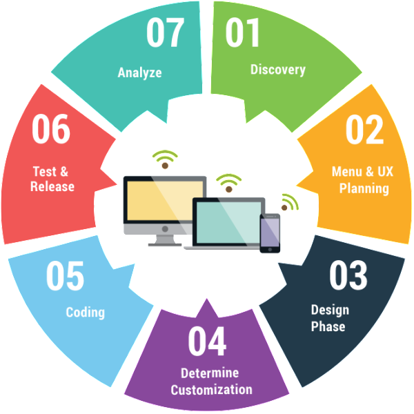
User experience (UX) is important in the web design process
When you are in the process of designing your website, keep these guiding UX rules in mind:
- Turn things easy and intuitive.
- Communicate all the concepts in a logical succession.
- Meet all needs of your audience and withstand the temptation to display your skills at the cost of usability.
Carefully researching your audience will assist you to build a design that caters to their wants and requirements.
8. Understand the fundamental of user interface (UI)
If you are new to this field of web design, you might be baffled by the difference between UX and UI that most of us are. Understand that there are two concepts-
Where UX is touched with the whole feel of a design, UI is all about the features. Suppose if you were in an elevator, UI would be the arrangement and size of its floor buttons. While UX would incorporate the textures, colors, and some other interior design options of the elevator space.
However, UI is about providing someone the best tools they require to experience your website free from every complexity.
When building your initial website, always keep these UI rules in mind:
- Interactive components should have obvious functionality.
- Accord must guide usability and actions should completely follow logical patterns.
- Create your own choice of design with a clear purpose.
Read:Which are the best App Design Tools for Developers in 2022
Adopt the design principles for guidance to your web design process

Design principles for guidance to your web design process
Practical web designing is well guided by some rules and it’s vital to know primary web design skills before you head further. However, certain prime practices will ease the entire process and provide a more polished end product.
Layout
Knowing the layout is essential if you desire to build your own website. It is recommended to keep things minimal and work with just a few elements to put focus on better placement.
Always think of grids before heading for designing since it will facilitate you in allocating the design elements. With the help of gird, design elements including images and div blocks will be arranged logically.
Furthermore, your layout’s structure should completely follow an optical hierarchy. A visual hierarchy requires sticking to the traditional patterns employ when reading.
The two popular pattern hierarchies that most people mostly follow are the Z-pattern and the F-pattern. Being entirely familiar with how all these patterns work will certainly assist you in planning your own content.
The F-pattern is more popular for designs with solid content blocks. The eyes of your audience will completely check down the left side of a layout until all the things grab their attention and later read from left to right.
Just think yourself searching through the menu of a restaurant – you might skip a few bold dishes names situated on the left until you reach to something that catches you, which will eventually develop an urge in you to read the other details demonstrating that particular dish.
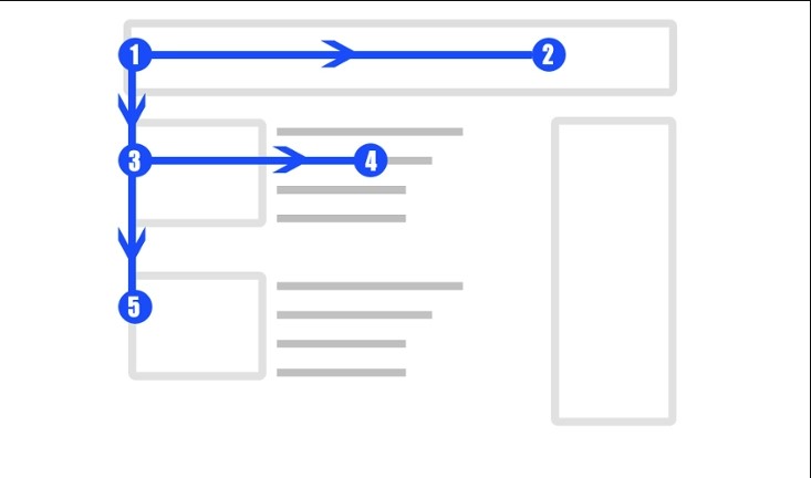
F pattern hierarchy in web design
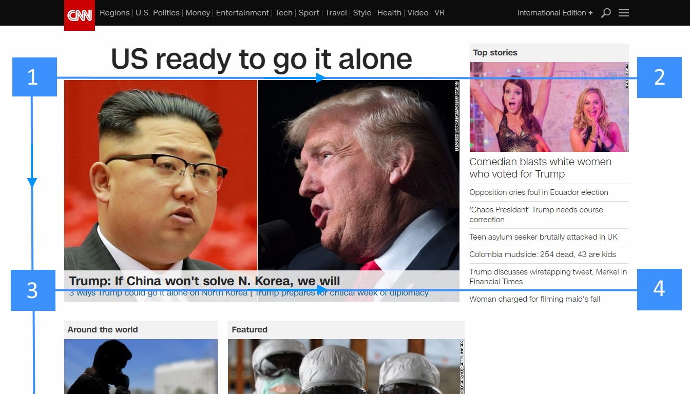
CNN is an example of web design using the F pattern hierarchy
There are many people out there who will read through something just like reading a blog in F-pattern. Look at the posts of Nelson Abalos, he has taken advantage of this design technique with bulleted sentences and left-aligned text thereby turning his posts simply to follow and navigate.
The Z-pattern is well connected with a low text-hefty design. Several landing pages adhere to this pattern. Basically, all the main elements on this Conservation guide website stick to the Z-pattern. As a beginner, you will consider this an easy layout trick to assist usability.
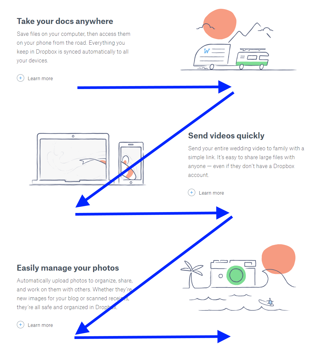
Z pattern hierarchy in web design
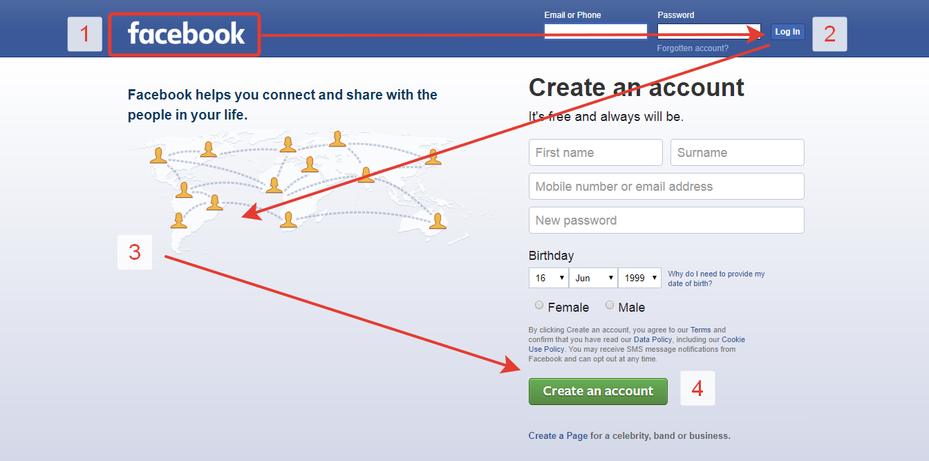
Facebook is an example of web design using the F pattern hierarchy
Color
You have every color available for you that you wish for. We know that with hefty power arrives hefty responsibility. Your choice of color will decide the good and bad for you. Here comes some great approaches to opting for a good color scheme for your initial website.
Monochrome
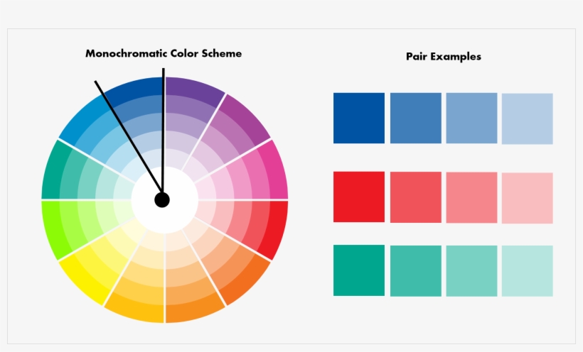
Go for a single color as a base, then check for the amount of saturation you want along with darks and lights, and play along with different hues for a standard color scheme. No matter what your niche is, a monochrome website is truly a bold choice. And don’t forget whatever color you opt for the text, just ensure that you consider readability issues too.
So, here we have taken an example from Unique, every section is displayed by a monochromatic color scheme. Besides, there is no need for you to bring this into your early designs, however, it is a great view of their usage of a variety of monochromatic color variations. Moreover, it is a good design trick that turns into a harmonious color scheme.
Complementary
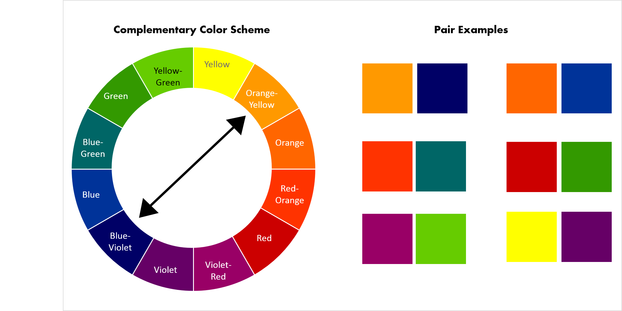
Choose some opposite colors from the color wheel and integrate them. Seems easy, correct?
Go for complementary colors with due care and here in this design below from the Igninis site, the designer has used orange and blue in various combinations with some grey and whitespace for a better layout that would never tire your eyes. Moreover, this whole contrast seems interesting and crisp.
Typography
Webflow arrives with a broad selection of fonts and other options to add more. Typography is basically a two-dimensional architecture, completely based on imagination and experience along with the guidance of readability and rules. So what rules as a beginner do you require to know?
Think of a birthday invitation or any announcement where an elegant typeface would work well but it would not suit better on a few other occasions. So, when designing your website, keep the tone in mind whether it’s giving a light vibe such as a food blog, or being playful in fonts that make a little sense. However, if you are building a website for a professional firm, then adhere to more professional typefaces.
Serifs versus non-serifs
There’s a basic mistake made by every new designer is to mix up serif and non-serif fonts. The point is the ends of the serif letter have one more extra line or a stroke extended horizontally and vertically.
Following are the differences between PT Serif and PT Sans (without the serif).
PT Serif:

PT Sans:

Serifs are an artifact from a long-ago of printing presses. At that time, most of the words we read were printed with ink on paper. There were words anchored in Serif onto the page and turn them simpler to read. When the web had just come, serifs were somewhat ignored by web designers as lower screen resolutions weakened them. Currently, those screens are well-optimized for typography with serifs, indeed they have made a comeback.
Those tiny lines make a hefty difference and you will see the above PT Serif typeface looks a lot formal and the sans-serif a little loose and light. Serif fonts seem very complex but they are well used in moderation. To put them, choose the headers and hefty blocks of content that profit from an easier font without serifs.
Embellishment versus practicality
The rings of a grown font will certainly add personality and charm to a design, however, don’t overuse over-frilly fonts. A website is all about what your audience perceives of it via your content. Moreover, readability is one of a font’s most significant features.
Typography technicalities
Typography has many things to discuss as you grow further as a designer, you will need to master typography setup including line height, weight, and kerning. However, don’t get too caught up in twitching all the difficulties for your initial website. You can take time and put your focus on ensuring everything is readable first and changing the details later on.
Commence designing
All the tutorials you have gone through and the research you did has positively contributed to your learning. However, in the end, only practice makes perfect. Start your web design process today, it doesn’t matter if you can make a wow work. Practicing is a valuable chance for you to apply what you have acquired.
So, don’t worry if it’s not great, just be proud of passing that origin from aspiring Designer to being one and then you are on your route.
Get feedback
You completed your initial design, and that’s great! You have put in your best efforts and are now ready to display it to the audience. However, before you go live, it’s important to get some outside viewpoints on what you have created.Despite the fact that getting helpful criticism can be sometimes uncomfortable, it is a vital part of the design process.
Building something – whether it’s an essay, a website, or a painting – is an act of vulnerability, and the things you showcase to the world define who you are and what you can bring to the world. It can be tempting to feel like a personal attack if someone corrects you or tells you that you are wrong, but feedback is a must in order to improve and become the best version of yourself.
So, learn how to first set your ego aside from all and separate the feedback from your self-worth. When you start gaining experience, you will be better able to recognize and apply practical and useful feedback. You will get to know that more experienced designers know what it’s like to be fresher and they are all thrilled to view less-experienced designers grow.
Closing thoughts
Gone are the days when you have to learn the code line by line to build a whole new website from scratch. Now, you have us at your back to get your ideal website to life. InApps is proud to have a team of experts who is in charge ofall of the steps needed in the web design process: planning content, coding, designing UI & UX, testing, and publishing.
What you need is to keep in mind all of the aforementioned core steps in the web design process and be able to learn the difference between good and bad design. If you have any other questions on developing a website, don’t hesitate to contact us here.
FAQs
-
Which is the most common language used in web designing?
The most common language that is employed in web designing is HTML. Along with HTML being used in creating the layout and website structure, CSS is also used for styling.
-
Which are top web designing software?
1. Wix
2. Webflow
3. Adobe Dreamweaver
4. Google Web designer
5. Weebly
6. GIMP
7. Squarespace
8. Bootstrap Studio -
What are the basics of Web design?
The significant elements of web designing are concise, great navigation, dynamic pages, operational links. Certainly, good spelling and grammar are also there and you need to keep these things in mind as you add graphics and color.
-
How to start a full web design process?
Pick something basic and simple for your initial design.
Get some inspiration from other designers.
Search for more sources outside.
Research deeply about different sorts of design.
Get your content ready before you head further.
Make your design a bit simple and intuitive.
[sociallocker id=”2721″]
List of Keywords users find our article on Google:
| web design vs product design |
| web designing software |
| awwwards |
| wix website designer |
| wix web design |
| awwards |
| google web designer |
| web development company |
| wix web designer |
| webflow showcase |
| indeed web developer |
| wawa menu |
| webflow form file upload |
| ux portfolio squarespace |
| best website design |
| typewolf |
| typography logo design inspiration |
| squarespace inspiration websites |
| behance portfolio examples |
| webflow vs wix |
| good website design |
| wix 10k |
| wix trustpilot |
| webflow templates |
| web app design inspiration |
| restaurant interior design software |
| webflow designers for hire |
| wix web design services |
| wix website design |
| web design structure template |
| healthcare website design inspiration |
| wix website responsive |
| best weebly templates |
| ux case study |
| wix blog examples |
| wix website two languages |
| webflow or wix |
| create sitemap wix |
| web designers portfolio |
| web design services |
| behance web design |
| awwwards website |
| cms website design orange county |
| dribble design |
| webflow developer jobs |
| wix designs |
| webflow ux design portfolio |
| hire webflow designers |
| adobe experience manager cms tutorial |
| wix owner app |
| hire webflow designer |
| weebly website examples |
| google web designer templates |
| wix website tutorial |
| wix restaurant menu |
| wix website examples |
| best fonts for real estate logos |
| wix website forum |
| wix website html code |
| top web design firms |
| web designing |
| wix website guide |
| top web design and development companies |
| website structure design tool |
| website layout structure |
| web design structure |
| website design company |
| awwwards real estate |
| ecommerce website templates dreamweaver |
| awwwards fonts |
| awwwards portfolio |
| showcase webflow |
| awwwards architecture |
| web awwwards |
| abduzeedo |
| typography layout design |
| dribbble jobs |
| orange county cms website design |
| wix website templates |
| webdesign inspiration 2022 |
| weebly design templates |
| cms design inspiration |
| wix hire a partner |
| webflow ux portfolio |
| weebly blog templates |
| best webflow sites |
| web designing jobs |
| dreamweaver css tutorial |
| wix photography templates |
| wawa pay |
| wix website in different languages |
| wix website example |
| how can i learn web design? |
| make a website design |
| website design structure |
| best web development company |
| web design company website |
| web design company |
| custom web development services |
| type wolf |
| behance ux case study |
| is indeed a saas company |
| behance app design |
| abduzeedo design inspiration |
| “core mood food blog” |
| behance menu design |
| behance webdesign |
| indeed interior design jobs |
| awwward website |
| best webflow websites |
| pinterest ui ux review |
| food web design inspiration |
| mobile website template dreamweaver |
| wix seo partner cost |
| framed typography poster |
| landing page ui design inspiration |
| indeed ats |
| cms website development orange county |
| ats indeed |
| dribbble tips |
| r getmotivated |
| layout design inspiration |
| become a ux designer from scratch |
| beginner ux portfolio examples |
| squarespace templates for interior designers |
| wix website designs |
| weebly template |
| wix web app |
| elegant logo design inspiration |
| graphic design layout inspiration |
| behance keywords |
| squarespace ux portfolio templates |
| webflow link color |
| webflow best websites |
| aaawards |
| wix writing portfolio |
| wix website photography |
| cool fonts in gimp |
| creative landing page design outsourcing |
| best squarespace template for ux portfolio |
| squarespace templates photography |
| ux design case study |
| typography logo designers |
| wawa alterations |
| webflow collections |
| form file upload webflow |
| squarespace ux design portfolio |
| webflow developer for hire |
| studio printing el segundo |
| ui ux design inspiration |
| web design layout inspiration |
| typography design inspiration |
| dreamweaver 4 |
| interactive furniture layout using interior design guidelines |
| add font to wix |
| initial logo designs |
| always designing for people |
| webflow inspiration |
| ux case study examples |
| wix web design cost |
| best squarespace template for interior design |
| vscode increase font size |
| mobile menu squarespace |
| ui ux inspiration |
| wix restaurant templates |
| hire webflow developer |
| weebly how to change font |
| hire webflow developers |
| 브랜딩 무드보드 |
| webflow upload file |
| weebly sitemap |
| wix vietnam |
| furniture site ux |
| upload form squarespace |
| webflow file upload |
| adobe dreamweaver reviews |
| file upload webflow |
| weebly seo specialist services |
| hire wix developer |
| logo awwwards |
| best website inspirations 2022 |
| web design examples |
| wix website different languages |
| wix website faq |
| 7 ux principles |
| webflow developers |
| principles of designing a memorable user experience |
| principles of ux design |
| ux design principles |
| top web development |
| color emotion guide |
| web designing firms |
| best web designing company |
| the website design |
| web designing company |
| best web development services company |
| web design and development services |
| web design company websites |
| best website designing company |
| website design and development |
| wix editor x vietnam |
| indeed ui ux designer |
| abduzeedo logo |
| behance interior design |
| ecommerce website dribbble |
| wix blog change font |
| awwwards jobs |
| “core web vitals consultant” |
| bitsimple.biz reviews |
| mobile app design behance |
| behance for developers |
| mobile app design dribbble |
| portfolio website design pinterest |
| landing page design dribbble |
| typewolf serif |
| awwwards free fonts |
| bootstrap studio forum |
| abduzeedo tutorials |
| behance interior design portfolio |
| free fonts behance |
| awwwards website templates |
| wix free templates |
| abduzeedo design |
| happy birthday typography |
| web design awwwards |
| content manager indeed |
| ecommerce awwwards |
| behance net worth |
| web.fleet complete |
| abduzeedo font |
| hire gimp developers |
| indeed front end |
| behance customer service |
| hcmc blue building |
| wix web page design |
| advise worth ignoring choosing website designer |
| which is most common language used in web designing ? |
| furniture poster templates |
| best adobe font pairings |
| dribbble portfolio website |
| how to get featured on behance |
| awwwards navigation |
| retail interior design blog net |
| “studio-webesign.com” |
| cms offshore in vietnam |
| css awards portfolio |
| saas development company orange county |
| simply graphic blog |
| indeed graphic design |
| wix design templates |
| dribbble colors |
| ux pins |
| adobe business development representative |
| portfolio design behance |
| sites like aspiring minds |
| wix.com templates |
| behance key people |
| webflow add fonts |
| webflow designer jobs |
| dribbble post size |
| monochromatic poster design |
| typography poster examples |
| web fleet complete |
| webflow showcase search |
| behance layout |
| dribbble color code |
| dribbble portfolio |
| squarespace mobile menu css |
| wix website ideas |
| behance likes |
| webflow vertical align |
| custom weebly template |
| dynamic pages wix |
| weebly website tutorial |
| tourism website design inspiration |
| dribbble created by |
| fleet complete app |
| how to present ux case study |
| ui ux design case study |
| ux writing for beginners |
| webflow client first |
| which is most common language used in web designing |
| behance examples |
| behance website |
| custom weebly templates |
| drubbbler integrations |
| ecommerce website ux case study |
| ux design case study ideas |
| webflow linkedin |
| best squarespace font combinations |
| cakewalk forums |
| client first webflow |
| fresher ui ux designer jobs |
| how to save wix website as html |
| recruitment website design inspiration |
| webflow designer for hire |
| wix web designer jobs |
| awwwwards |
| dreamweaver developer job |
| web ui inspiration |
| webflowdeveloperjobs |
| hire poster designer |
| the anatomy of a great place to work |
| i always keep that thang on me |
| initial logo ideas |
| the brick wawa |
| webflow search bar |
| best weebly template |
| best wix website designs |
| bold commerce apps |
| typography food logo |
| awwwards 2020 |
| ui/ux portfolio behance |
| beyondweb |
| hire webflow expert |
| ux design portfolio squarespace |
| webflow extensions |
| mobile ui inspiration |
| pt sans free font |
| visual doing: a practical guide to incorporate visual thinking into your daily business and communication |
| web design el segundo |
| wix web designer near me |
| css awwwards |
| outsource interior photo edit vietnam |
| ui ux design agency vietnam |
| ui ux inspiration sites |
| wawa rt 3 |
| web design ho chi minh city |
| webflow paths integration |
| blog weebly templates |
| cheap typography logo design services |
| gimp font list |
| is webflow good for beginners |
| web designer jobs |
| web designer vietnam |
| webflow cms tutorial |
| free responsive dreamweaver templates |
| how to change text color on wix |
| mobile app design inspiration |
| ui ux fresher jobs |
| wheel game crypto software development |
| wix photography template |
| app website design inspiration |
| awaaards |
| behance web design portfolio |
| best squarespace template for architects |
| bootstrap food menu template |
| can you change your template on wix |
| cheap typography logo designers in usa |
| common language used in web designing |
| healthcare mobile app design templates |
| responsive web design wix |
| weebly change font |
| app design showcase |
| bootstrap telegram icon |
| css font stroke outside |
| dreamweaver responsive design |
| e commerce ux case study |
| squarespace 6 forms integration |
| wawa starting pay |
| website awwwards |
| weebly dmca |
| 5k poster ideas |
| adobe font combinations |
| art weebly templates |
| center image webflow |
| creative grids templates |
| outsource real estate image editing vietnam |
| poster portfolio case |
| squarespace interior design websites |
| squarespace upload file form |
| type design inspiration |
| ui moodboard |
| creative mobile app ui design |
| ecommerce ux case study |
| furniture design website templates |
| squarespace interior design templates |
| webflow vietnam |
| weebly seo tutorial |
| wix website templates free |
| “web design” marketing or website |
| adobe dreamweaver responsive templates |
| cheap typography logo design company |
| elevator interior design |
| mobile web designer near me |
| pattern designer jobs |
| the offshore restaurant & bar menu |
| wawa hot food menu |
| weebly web developer |
| best webflow templates |
| core web vitals webflow |
| squarespace fonts |
| webflow expert |
| what is dynamic page in wix |
| wix pro designer |
| align tool gimp |
| bad portfolio site examples |
| cms website inspiration |
| dribbble vs behance |
| expert webflow |
| how to become a ux designer at google |
| how to write a ux case study |
| squarespace form file upload |
| squarespace ux portfolio |
| template dreamweaver responsive free |
| top ux case studies |
| ui/ux inspiration |
| webflow job board template |
| adobe dreamweaver review |
| file upload form squarespace |
| fonts in elearning |
| game web design inspiration |
| gimp text stroke |
| rough fonts |
| adobe dreamweaver website templates |
| best ux case studies |
| best web development software |
| blog layout design inspiration |
| bootstrap studio review |
| squarespace attach file to form |
| squarespace file upload form |
| blog templates for weebly |
| dreamweaver webdesign |
| furniture ecommerce website templates |
| gimp fonts list |
| how to get clients on dribbble |
| job board template webflow |
| portfolio web inspiration |
| technology is everywhere essay |
| typography logo ideas |
| web design templates inspiration |
| hire weebly designer |
| mobile ui design inspiration |
| non profit website design inspiration |
| pt sans |
| squarespace how to change font color |
| vscode line height |
| webflow search cms |
| wix component |
| custom ink net worth |
| dreamweaver ecommerce templates |
| layout features functional skills |
| serif lab |
| ui/ux designer cover letter example |
| website layout inspiration |
| weebly blog examples |
| wix portfolio templates |
| wix templates portfolio |
| awwwards logo |
| how to become a succesful pattern designer |
| how to make portfolio website using html and css |
| famous typography logo |
| wix website not responsive |
| website design inspiration |
| website design software |
| creative landing page design |
| when you finish saving the world néz online |
| webflow designers |
| web design sites inspiration |
| web design layout |
| graphic design headers |
| creative website design ideas |
| mood board creator |
| typography poster design |
| webflow development |
| creative web design ideas |
| famous typography designers |
| ui/ux web designer |
| best web design services |
| example of typography |
| web design templates |
| ultimate web designs |
| top web designing company |
| best web design company |
| innovative web design |
| web page design |
| best web design and development company |
| best landing page design |
| website design online |
| user experience design principles |
| web design software |
| web design ux |
| website design firms |
| mobile app design and development company |
| ui ux design studio |
| best ecommerce website design |
| best tool for website design |
| best web design service |
| best web design company in usa |
| web design services company |
| ux design firm |
| front-end development company |
| the website design company |
| ecommerce web design & development |
| website design & web development company |
| ecommerce website designer |
| best web development services |
| web design & development |
| top website designing company |
| web design firm |
| website designing company |
| ecommerce website design |
| website design and development company |
| professional web development service |
| best ecommerce web development company |
| best ecommerce web developers |
| best website design company in usa |
| best ecommerce website development company |
| web designing & development company |
| web development services company |
| ecommerce web design company |
| website designing company in usa |
| custom web development company |
| professional web development services |
| custom web designing services |
| website design & development services |
| website development company in usa |
| custom web design |
| ui ux design services company usa |
[/sociallocker]
Let’s create the next big thing together!
Coming together is a beginning. Keeping together is progress. Working together is success.


