- Home
- >
- Inbound Marketing
- >
- 10 Key Components Of A Landing Page To Capture Leads
10 Key Components Of A Landing Page To Capture Leads
If you’re digitalizing your business, including marketing campaigns. You might be interested in how to be more incentive to your customers and make your products stay above the rest of other online competitors. The quick answer is “create a compelling landing page”.
This article will guide you through the world of landing pages. We’ll provide you with information from A-Z to make your website successful:
- What’ is landing page
- Why you should build a landing page
- 10 key components to make your landing page start generating leads
What is landing page?
A landing page is a webpage designed to persuade users to take one specific action. This page is often a standalone page that is separated from your homepage.
Usually, a landing page is used for a single purpose. For instance, having users sign up for a newsletter, purchase a product, or RSVP for an event.
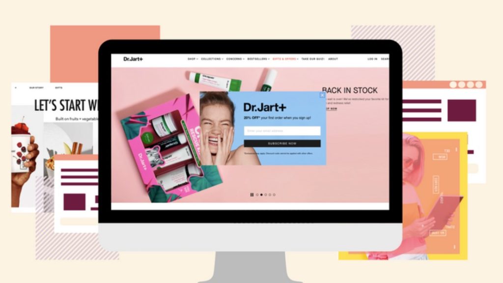
Example of a landing page
Why You Need to Include Landing Pages in Your Digital Marketing Strategy
A landing page is a follow-up to any promises you’ve made in your content. Therefore, it is often considered the next step to convert a visitor into your customer.
Your job is to make the landing page so convincing that customers are willing to exchange their personal details for your offer. In other words, you have to brainstorm how to optimize your landing page from the smallest detail.
Once you get valuable lead contact from your landing page, the chance you will get a higher conversion rate will increase.
A Landing Page Inspires Your Audience to Act
It’s called a landing page because, when a potential lead clicks on one of your links or ads to get more information, they will quickly “land” on this descriptive and very attractive page.
You might also recognize the landing page by its various other names, including:
- Splash page
- Lead capture page
- Magnet page
A high-converting landing page should definitely be a top priority for your online business strategy.
Landing pages strategically place the product, service, and/or brand image your leads want to learn more about right in front of their screens. All in one simple, easy-to-read format.
This makes it extremely easy for your audience to act and become paying customers.
Now that you know why you should include a landing page in your strategy, it’s time to learn how to build one from the inside out!
10 key components every effective landing page should have
1. Format Your Form Header & Form Fields
First and foremost, let’s talk about the form header and form fields on your landing page.
While this is one of the smaller spaces on the page, it’s also part of the main meat of the document. Here’s why.
Efficiently Collect Your Audiences’ Information
The form header and form fields are what you’ll use to collect data from the users who visit the landing page and want to learn and connect more with your brand.
First, the form header draws attention to the form fields themselves. Oftentimes, this header will state something along the lines of, “Ready to learn more/get started?”
The purpose of the header is to draw eyes toward the form itself.
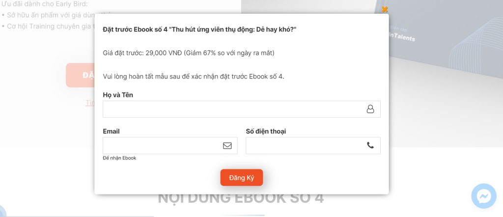
Form on a landing page
Next, the form fields are simple cues to let people fill in the appropriate information, including:
- Name
- E-mail address
- Any other relevant information you want to know about them
More often than not, the entire form is found close to the top, right-hand side of the landing page. This is so it can be quickly and easily seen and accessed by your audience.
2. Include an Inviting Subheading
Next, it’s time to include a subheader. Although the subheader is not directly related to the form header, it is used as a way to explain in brief and concise terms what you’ll be “selling” to the users visiting your page.
In fact, the subheader is predominantly used to hook the user and let them read about the products or services you can offer them to make their life more convenient.
Although it’s called the “subheader,” this section actually functions more as the main header for the entire document than a minor or secondary header.
With that being said, your subheader should be open, inviting, and on-point with your brand and the audience you are targeting.
3. Create Momentum with Support Copy
Throughout your document, you’ll want to use supporting copy that goes further into detail. Explain how you can help the user and what you’ll provide them in exchange for their information.
Supporting copy can be diverse and serve various functions because it will be sprinkled throughout the document. Add it whenever you’re trying to make a concise and specific selling point about your product.
Your supporting copy should be professional yet engaging. It should give your user a reason to continue reading and interacting with the document. The way you construct your copy heavily depends on your brand image and the target audience you are trying to reach.
4. Entice Your Leads to Act with a Call to Action
The call to action (CTA) is a short bit of strategically written, compelling copy that may include its own header, internal links, and supporting copy.
CTAs are placed in a number of different places on your landing page. In fact, some landing pages even have multiple calls to action within their text.

Simply stated, the call to action gives your user a timeframe, usually short, in which they should sign up for your products or services.
The call to action gives a sense of urgency to the proposition that you’re offering. It should elicit fear of missing out within the users visiting your landing page.
Furthermore, this crucial element is usually placed at the bottom of the page or after your main proposition statement. But it’s also one of the most important characteristics of a landing page.
5. Provide a GDPR Compliant Statement
GDPR stands for General Data Protection Regulation and is a type of document that is sort of like a summarized version of your full-length privacy policy. This is a tiny piece of your landing page, but one of the utmost importance. Here’s why.
The law requires that you include a GDPR statement, ensuring that those who have gone through your landing page and are ultimately choosing to interact with you have read your privacy policy.
This statement is usually in small print and comes with a checkbox that lets those in charge know that the statement was read and complied with by the user.
The next component in this guide is definitely something you need to include in your landing page to improve user experience (UX). Keep reading to find out what it is!
6. Design a Hero Image, Animation, or Video
Not every landing page has a hero image, animation, or video on it. But, it’s usually a mistake to leave out this creative element. Visuals further draw attention to your value proposition and allow users to see it in action.
If you opt for a hero image, then you will need to capture and/or design a clear web banner image that will go front and center on your landing page.
As for animation and video, here’s the good news: Great production value is usually inexpensive because the video is not long. But the importance of this section cannot be overstated. Customers who see the product in action are far more likely to buy it or enter their information than those who don’t see the product in use.
7. Incorporate Persuasive Social Proof
Online, it’s impossible to tell what’s real and what’s not. One of the most compelling pieces of evidence that the operation you’re running is legitimate, and that it has satisfied customers in the past, is social proof.
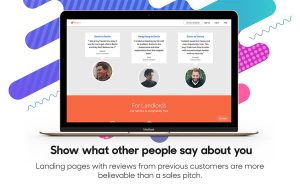
Social proof boils down to reviews, testimonials, and other recommendations made to the user by other, ordinary people. When customers see that others like them have used the product and are satisfied with it, they’re more likely to accept your proposition and relax.
There are scams and shoddy quality everywhere online, but legitimate social proof counteracts these assumptions. It’s simple psychology, and it works!
8. Insert an Impactful Reinforcing Statement
Depending on the size of your landing page, you’ll probably want to include a reinforcing statement and some additional benefits of your product. These are usually located at the bottom of the page and help to summarize the points you’ve made, on top of maintaining interest.
Some landing pages are actually quite large and go into further detail about the company and quality of customer care and satisfaction. These points are usually made in the section dedicated to the reinforcing statement and benefits.
Highlight All of the Key Benefits
Before you head to the next key element of your landing page, it’s useful to point out that you should highlight the benefits of your product, service, or incentive. It helps the audience visualize how your brand will help them in the long run and improve their chances of actually converting.
Bonus points if your social proof (i.e. testimonials and reviews) also point out these main benefits!
9. List Important Features Of Eye-Catching Graphics
There’s seldom a landing page built today without the features listed at the bottom of the page alongside some simple yet striking graphics. This section will serve as a final summary of what your product does and how your company can help the user.
For example, a computer maintenance shop might have some graphics of a computer, a dollar sign, and a clock, synching up with their features of quality, affordability, and speed.
This section is short and sweet, as you’ve already sold (or dissuaded) the user above. The section exists as a simple and final point of emphasis on what you can provide that other companies can’t.
10. Add the Finishing Touches with a Footer
Finally, there’s the footer. This last section is the final cherry on top. The footer adds synergy to your document and creates a unique brand aesthetic that will allow the document to stand out in the user’s mind.
Simply put, the footer is not used for any true sales purpose for the specific page itself. The goal is to help those who visit the page keep your company in mind and associate your products or service with your logo and corporate colors.
At the end of the day, it unifies your entire landing page and keeps everything looking neat and tidy!
Get More Tips For Your IT Project with InApps
Congratulation! Now you own essential tips to start making a powerful landing page for your business.
Combined with a strong understanding of your target audience and business core values, your landing page promise to take you one step closer to success.
Find our guidelines on the 10 Key Components For Landing Page to Capture Leads helpful? Follow us for more content!
If you hope to optimize your website for better business performance and user experience, InApps is ready to bring you further advice and consultation. Contact us here!
List of keywords to find our post!
[sociallocker id=”2721″]
| landing page |
| landing pages |
| “saas” conversion |
| “saas marketing” -site:facebook.com -site:youtube.com -site:twitter.com |
| what is landing page |
| key components of a landing page |
| what are the key components of a landing page |
| lending page |
| landingpage |
| landing page components |
| growth driven design proposal |
| portfolio landing pages |
| “inbound marketing” |
| landing pages inbound marketing |
| landing page. |
| inbound expert target |
| crucial software download |
| dive bomb industries |
| 919 marketing |
| crucial products |
| needs update |
| landing lage |
| lamding page |
| landiing page |
| landing paga |
| landing page? |
| lnding page |
| landin page |
| landing-page |
| landing oage |
| landinf page |
| “lead capture” |
| what are the key components of a landing page? |
| what is inbound expert target |
| target inbound expert |
| target inbound |
| 3450 ward street |
| aesthetic header |
| linkedin cta |
| crucial components |
| hope components |
| landing linkedin |
| i do hope that you will give me all the necessary attention and assistance required to e actualize this life ambition |
| inbound expert |
| net10 |
| get more seller leads florida |
| hjelp til inbound marketing |
| inbound marketing landing pages |
| leads page |
[/sociallocker]
Let’s create the next big thing together!
Coming together is a beginning. Keeping together is progress. Working together is success.


