- Home
- >
- Management
- >
- Online Job Portal Web App Development Using React Native
Defining the problem
The web app is developed to serve the purpose of finding services for daily chores, household tasks, or personal wellness affairs. It also acts as a third-party platform to connect service providers with potential clients on a broader level.
This is a niche market in the industry that can be explored. Although there are several app models like this in the market, none of them help users solve the problem exhaustedly.
Therefore, our client wanted InApps create a solution from start to end.
The design challenge
Our challenge was to overcome the usual norm which is to limit the scope of the app within a given community, but also make it happens on a larger geographical scale.
After an intensive brainstorming and ideating process, we shed light on the app’s design, functionality, and usability. Then our business analysts processed market research.
Design conceptualisation
Our team of UX consultants and UI architects assisted in the design of a highly responsive and intuitive mobile and web app after a detailed listing of all the features and requirements gathered for the project.
We began by sketching wireframes in order to achieve simplicity and place information at the center of our design. This aided us in capturing the precise requirements and creating a skeleton of the actual product.
The core UX fundamentals
For InApps, a good design is a design that has relevant information provided to users at the right time and with minimum effort. We also integrated some features as hoping to facilitate our users to reach their goals with the least effort, with the utmost easy-to-use design.
Switch account
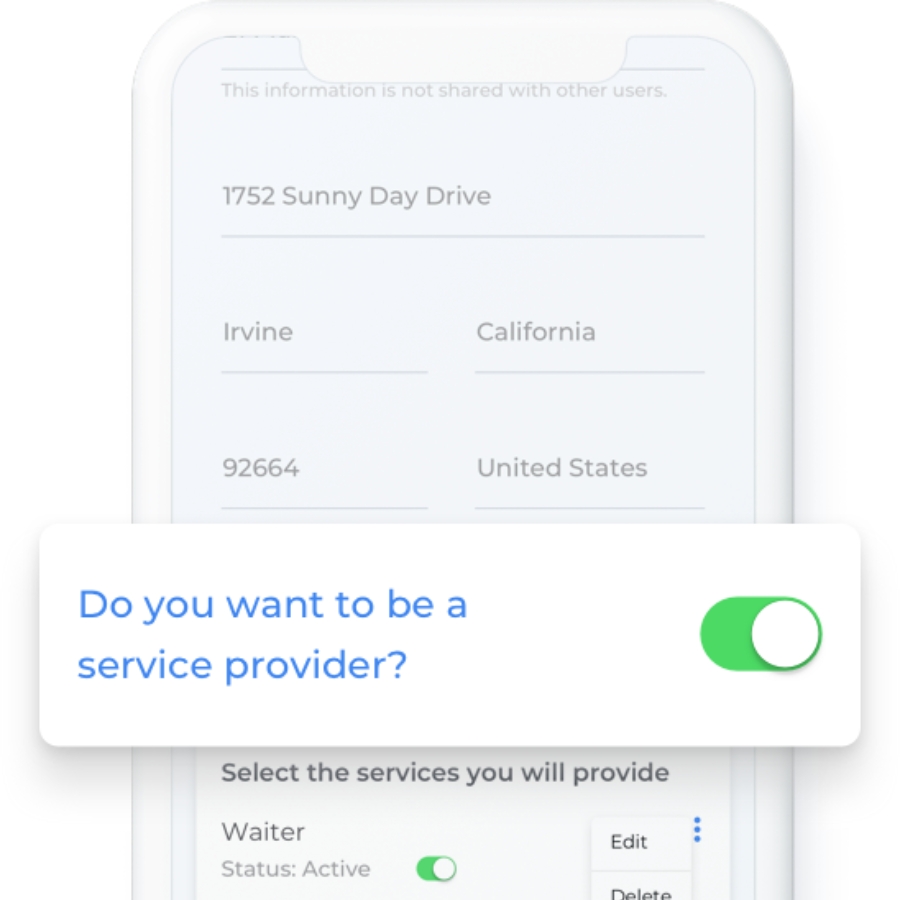
We wanted to create a community through the web app, so we allowed the users to easily switch from a job provider to a service seeker and vice versa. This made the platform more viable and efficient for everyone involved and was a winning feature of the platform.
Service listing
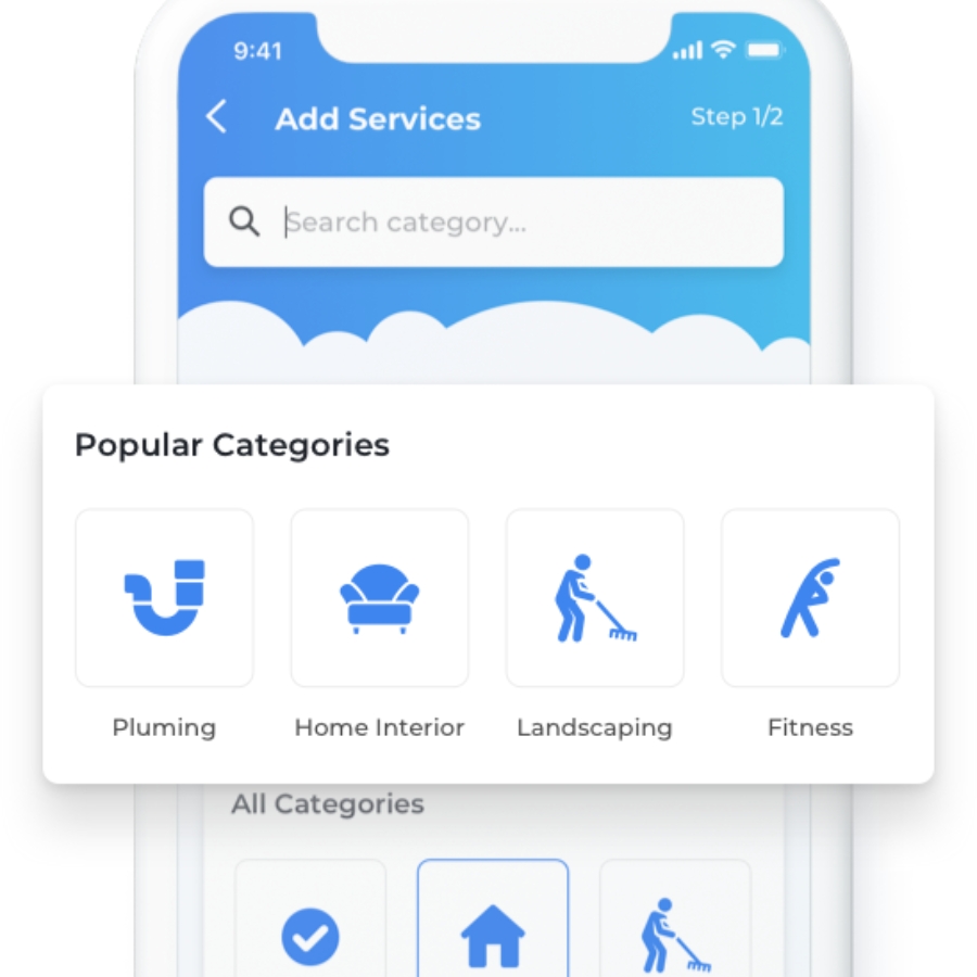
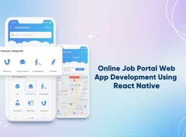
Since there was a long list of services to choose from , we used different techniques to make the app easy to navigate with the help of various icons and call to action buttons. Our focus was to keep the user behaviour in mind at all times and enhance their user experience likewise.
Filter by address
We let users find services near them through their postal code and street addresses. We added multiple service category icons alongside for easy filtered search. The overall look was kept clean with visible icons for quick search results.
Detailed map listing
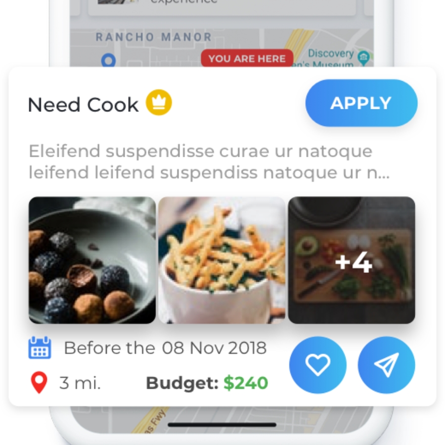
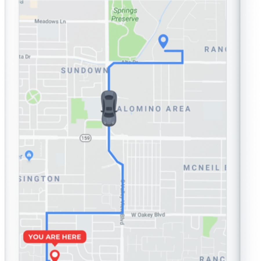
We provided a map view of service providers with detailed description for each provider. The map view would show the distance between the service provider and finder. This feature was carefully curated to enhance the UX and deliver the best results.
Real-time tracking
We also incorporated a real-time tracking feature that allows service providers to keep track of their appointments and their progress. This feature was designed to help improve the efficiency of the transaction.
Built-in chat & message requests
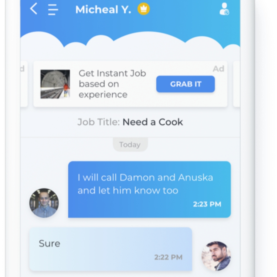
To accelerate communication, we added a chat option. To make the chat secure, we added an option for chat and message requests to allow only filtered messages. This not only helped users communicate when they wanted to but also created a community.
Design to Development
To build the web app we used React Native development which is a framework that supports both iOS and Android. This would help the client reach as many potential users as possible and the reusable components of React also made it a very cost-effective platform.
We developed an intuitive storefront in ReactJS to give life to our designs. We used NodeJS for end -to-end easy Backend API management. An additional benefit of automated unit cases for easy bug testing made the platform extremely impressive in terms of functionality.
Enhancing the idea
The client came to us with a very vague idea about hơ to build the app. Hence, our team of business analysts played an important role in developing the idea of the web app and proposed a development plan for the platform.
InApps’ expert suggests that we create a free and secure platform that offers paid services between individuals. The app’s vision is to bring people who’re seeking services and who’re proving services together by making it easy to pinpoint everyday tasks or services in local communities. This is the background of the idea “by helping each other, we can call benefit”.
Identifying the user & their challenges
The biggest challenge of the project was identifying user personas and mapping out the user journey, which were critical for the successful implementation of the idea.
We realized that the app would have to be designed in a way that it would be easy to use and relevant for different audiences, as there was no specific target audience.
Visual & aesthetic design
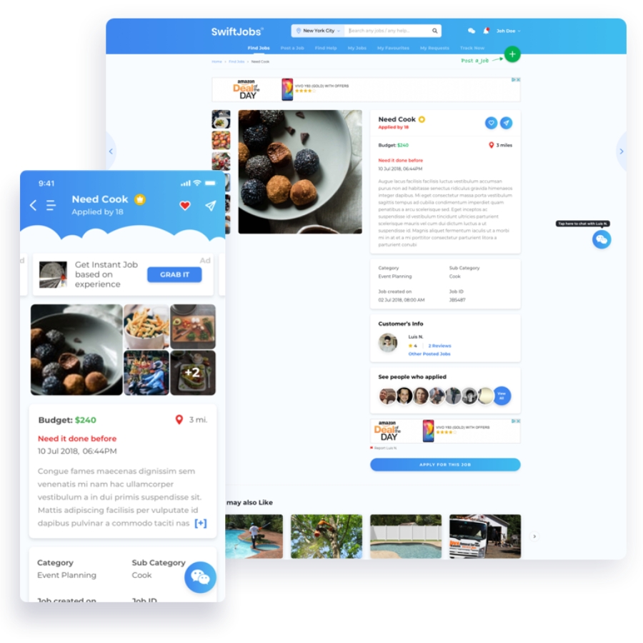
Next, we worked on the visual design of the app, which was designed to make it easy to use and catch the users’ attention. The combination of white and blue colors was used to create a sleek and elegant look.
The blue gradients were used to create a sleek and elegant look across the white background. We then added a cloud theme to complement the overall look.
The final take away
We had previously worked on various job portals, including those focused on blue and white-collar jobs.
The project was a stand-out for us as it was designed to cater to an industry that needed a platform that would allow service providers to easily hire and connect with potential clients. The team members were also able to learn how to help these individuals meet their clients on a daily basis.
Let’s create the next big thing together!
Coming together is a beginning. Keeping together is progress. Working together is success.


