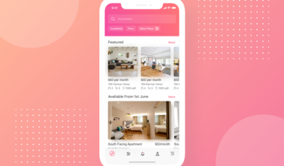
The basic search bar design includes a question input box and a submit button. You may think that this function does not need much attention, however, on a website with a lot of content, the search bar acts as a powerful assistant to provide a better user experience design.
When we interact a lot with users, customers and during the implementation of projects, we find bar search activities ineffective for two reasons:
- User’s search skills are inefficient
- Not optimal interface design
We cannot improve the first part of the reason. Instead, professional website designers and individuals need to optimize the interface of the search function to create convenience for users and assist them in performing related tasks easier.
Why is the Search Bar Design important?
1. Convenient
On a website with a lot of content, users tend to use the search bar to get specific information rather than using on-page navigation. This helps them save time and get information more efficiently.
2. Easy to use
The date search function becomes more popular than before and is continuously improved. Currently, we have voice search technology like Apple’s Siri or Amazon’s Alexa or image search on e-commerce websites. Even kids these days know how to search for cartoons on YouTube! All thanks to the smart and efficient search bar.
3. User retention
When using tools like Google, Yahoo, Bing, … people often tend to change words and sentences to find the content they want. The same goes for the site’s search bar. Users can search multiple times for the same keyword with different variations until they satisfy their search needs. So what you need to do is understand the user behavior and their wishes when accessing the website to create corresponding content.
4. Increase conversions
According to research on e-commerce websites, 43% of users use the search function as soon as they land on the page instead of the navigating web experience. Users using the search bar are up to 216% more likely to become customers, and the average revenue from these audiences is higher than from other customers.
User behavior
When users start searching, they are actually beginning a journey, and this journey often begins with noticing the search bar. Therefore, you need to pay attention to the placement and how to design the interface for the search bar. To optimize this tool, check out some design tips below.
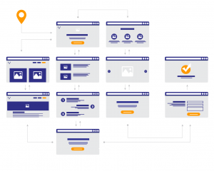
06 Tips to optimize Search Bar Design
1. Visual highlights
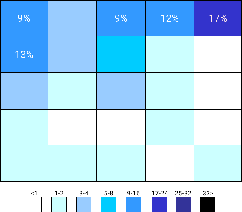
Typically, the search bar is placed in the middle of the menu bar and this is a prime location, the most logical because users can realize this function even when visiting the website.
Below is a study of the positions of the icons that users will pay attention to. You can rely on it to find new placements for this toolbar, but we still recommend that you set it in the menu bar to display this function on all pages.
In addition, the visibility of search bar design is extremely important. Take a look at the image below to see the difference.

In the first image, the design is completely gone and only the magnifying glass icon is visible. If users don’t pay attention, they won’t discover the search function. On the contrary, the second design is separate from the background, attracting the attention of users and helping them to manipulate more easily.
2. Function clarification
It sounds funny, but instructing users to use the search bar will increase the effectiveness of this function. The following example will help you better visualize what InApps question.
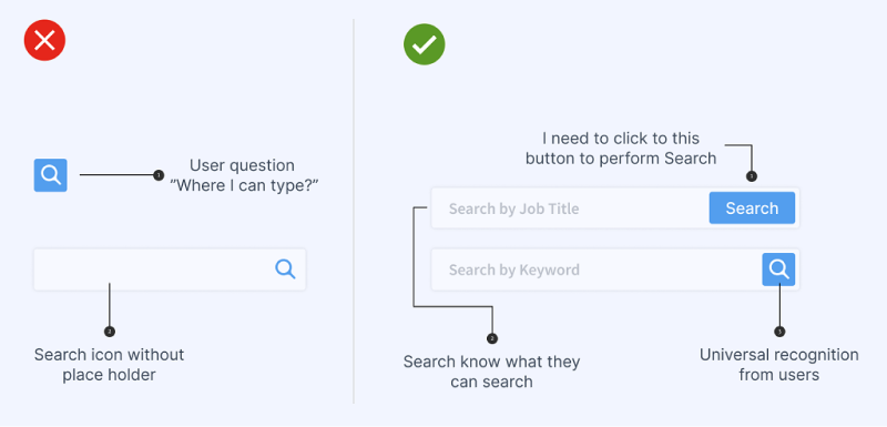
The figure on the left shows two design mistakes for this toolbar. If you just frame the search icon, users can’t find where to enter text. In the second case, the information box is clear but there is no separation. In contrast, the image on the right has a very clear structure between the content input – the CTA button and there are instructions for what to enter.
When comparing the two versions, it is clear that the right side is more visually impressive and easier to use.
3. Enough space to enter query
The search bar needs to show the entire user query to create a better experience. According to research on an e-commerce site, their users type an average of 14.5 characters in the query body. So this website designed enough space to display 27 characters for this toolbar.
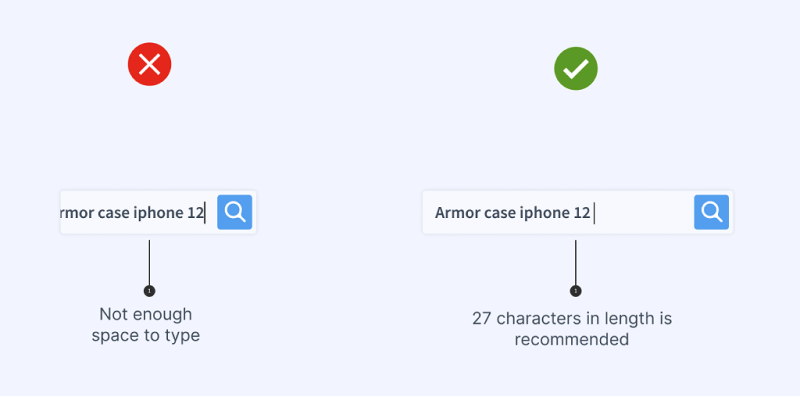
However, the standard search length of each site is different. The best option can be researched on the site’s search logs to check the user’s query time.
4. Search suggestions or archive searches
Except for the orientation of the content that users should fill out, you should set search suggestions or display previous searches. Information about search trends or their search history stimulates users to query more and stay on the site longer.
5. Provides advanced search
Advanced search assists users in detailing their needs, increasing conversions.

Depending on the product, service, content on the website, the advanced search design will have different fields. You need to anticipate the user’s search intent to set it up accordingly. The ideal location for this function should be right next to the Search Bar on the right side.
6. Keep user queries on the results page
After displaying the search results, the user’s search keywords will be stored and displayed. This helps them to refine the query if the results are not displayed exactly as they expected, or show less or too much data or no results.
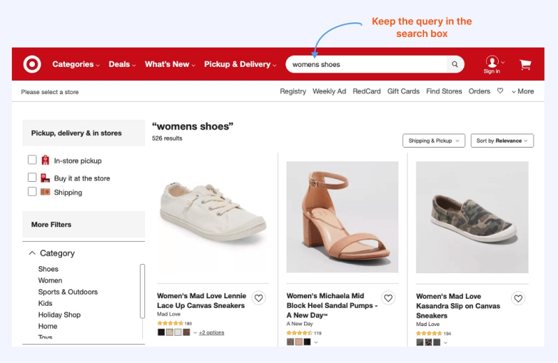
In case the search keyword is not on the website, you need to inform about this, otherwise, the user thinks that the system is having problems.
Conclusion
If you read to the end of this blog, InApps hopes you can apply some of the above tips to increase the experience on your project website. In addition, you should monitor search logs to understand user behavior and know how they are using the search bar on your website.
In case you need a professional Web Design with optimized functions from interface to operation, we are ready to assist.
Let’s create the next big thing together!
Coming together is a beginning. Keeping together is progress. Working together is success.


